
Supply and demand zones are areas on a chart where traders look for a possible imbalance between buying and selling interest. They are estimates based on observed prices, not a direct inventory of every unfilled order in the market. A past departure from a zone can justify watching it again, but it does not prove that institutions are waiting there or that the next visit will produce the same response.
What Supply and Demand Means in Forex
At its core, the Forex market is just an endless tug-of-war between buyers and sellers.
When buyers are more aggressive than sellers, price goes up. They’re willing to pay higher prices because they believe the currency is gaining value, or maybe they just desperately need to get their orders filled. When sellers take over, price drops. Buyers step out of the way, and the market has to fall to find new people willing to buy.
That’s basic economics. But for us as traders, the real magic is figuring out where those large shifts in power started.
A true supply or demand zone isn’t just a random spot where price took a breather. It’s an area where the market took off like it was late for a flight. That sudden, violent departure tells us something important: the buy and sell orders were completely out of whack. One side totally crushed the other, and price had to adjust instantly.
In the Forex world, those kinds of moves don't come from retail traders trading mini lots from their laptops. They come from the heavy hitters—banks, hedge funds, and large institutions. These guys move so much volume that they can't just click "buy" and get filled all at once. They have to break their large orders into smaller chunks, leaving behind obvious footprints on our charts.
The whole strategy rests on this one idea: if price shot out of an area like a cannon, there's a good chance some of those large institutional orders didn't get filled. When price eventually wanders back to that zone, those leftover orders can trigger another big reaction.
It’s not magic, and it doesn't work 100% of the time, but if you pick your spots carefully and manage your risk, it can give you a very real edge.
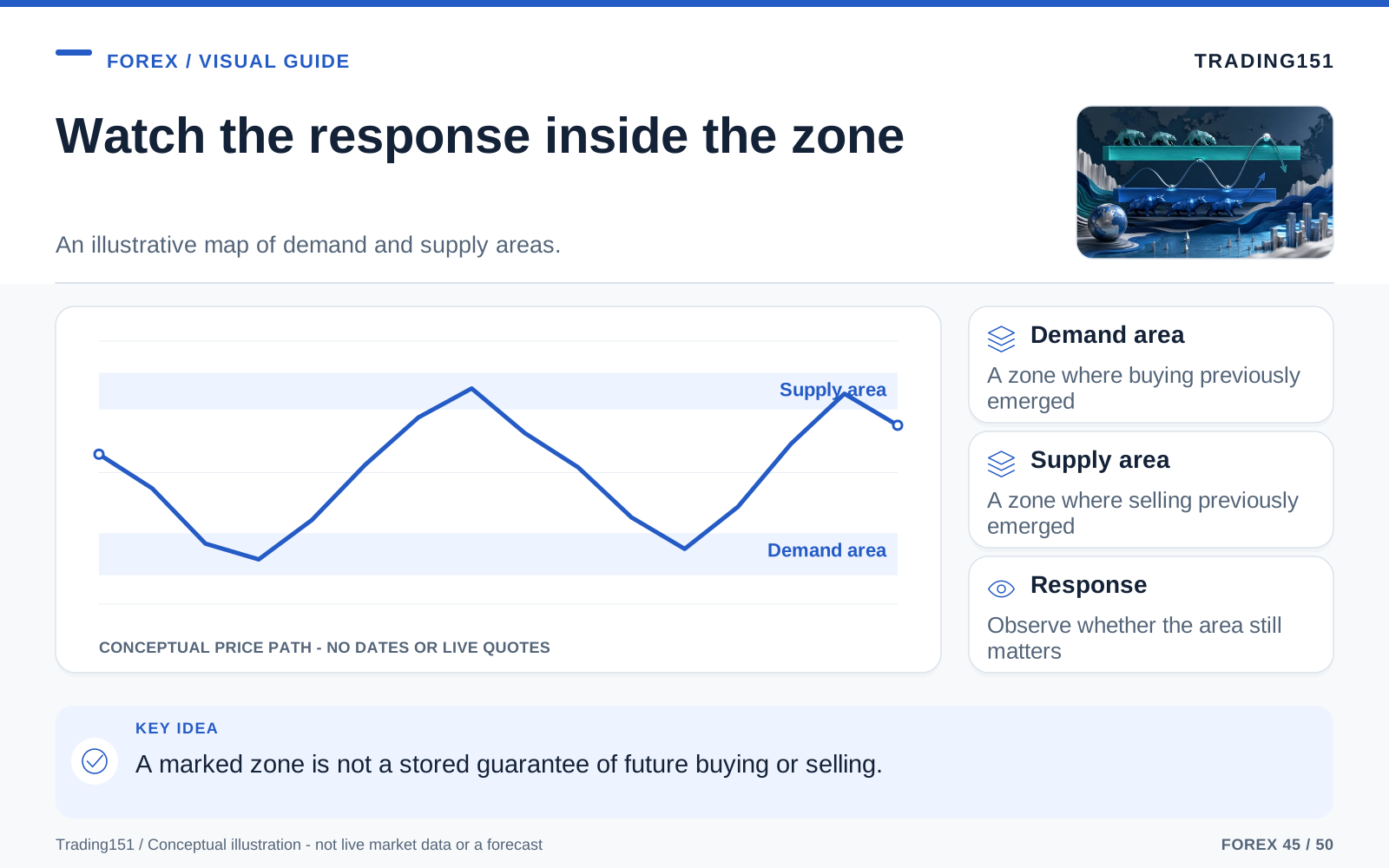
Read this diagram as text
- Demand area
- A zone where buying previously emerged
- Supply area
- A zone where selling previously emerged
- Response
- Observe whether the area still matters
Why Traders Associate Supply and Demand With Institutions
You’ll hear a lot of buzzwords in the trading world—things like "smart money" and "bank levels." Sometimes the hype goes a little far, but the core idea makes sense. When price leaves a level aggressively, it shows a huge imbalance. Now, your chart won't tell you the name of the bank that placed the trade, and you can't guarantee unfilled orders are still sitting there waiting for you. A zone should catch your eye because of how price behaved there, not because you’ve convinced yourself a hedge fund is hiding behind it.
Big financial players just don't trade the way we do. If a major bank needs to buy a billion euros, they can’t just dump that order into the market all at once without causing large slippage and ruining their own entry price. They have to layer their orders, staggering them across different price levels.
This is why we look for fast, aggressive departures from a tight consolidation. If price was just hovering in a small range and then suddenly launched into orbit, it tells us that someone with deep pockets stepped in. Maybe they finally absorbed all the selling pressure, or maybe they just dumped a large amount of volume into the market. Either way, that level is now highly significant.
Of course, not every big candle is a secret banking operation. News spikes, low liquidity periods, and trading algorithms can cause wild moves too. But practically speaking, it doesn't really matter who caused it. As a chart reader, your takeaway is the same: strong moves leave behind zones you need to watch.
That’s the beauty of it. You aren't playing a guessing game about who clicked the mouse. You’re just trading the obvious urgency they left behind on the screen.
Supply and Demand vs. Support and Resistance
At first glance, supply and demand feels a lot like old-school support and resistance. Both concepts look for areas where price might turn around. Both use past price action to predict future moves. Both help you figure out where to get in, where to put your stop, and where to take profits.
But there’s one large difference: supply and demand focuses on zones, not exact lines.
Traditional support and resistance usually has traders drawing a thin horizontal line across a previous high or low, expecting the market to bounce off that exact penny. Sometimes it does, which feels great. But more often than not, the market overshoots it, falls short, or just chops around the line to stop everyone out before making its real move.
Supply and demand treats these turning points as zones. This is a much more realistic way to look at the market. Big institutions rarely stack all their money at one exact pip. They spread it out over a price range. By drawing a zone instead of a razor-thin line, you give the market room to breathe and keep yourself from getting stopped out by random volatility.
- A demand zone is a block of space below the current price where aggressive buying previously forced the market up.
- A supply zone is a block of space above the current price where aggressive selling previously hammered the market down.
Think of it this way: support and resistance shows you where price stopped in the past. Supply and demand tells you why it might reverse there in the future.
How Supply and Demand Zones Form
Most of the time, zones form through a simple three-step process: price enters an area, stalls out for a bit, and then aggressively takes off.
That little stall is important. Traders call it the base. It’s a tight, sideways consolidation that happens right before the explosion. Picture it as a brief, intense negotiation between the buyers and the sellers. Eventually, one side wins, and price rockets away.
So, whenever you're looking at a chart, you want to spot these three pieces:
- The approach: how price traded into the area.
- The base: the tight pause or battleground.
- The departure: the explosive move that proves an imbalance.
The base is the actual box you’ll draw on your chart. But the departure is what makes that box worth drawing. If price just lazily drifted away from the base, forget it. It's just random chop.
The Four Core Supply and Demand Patterns
You can group almost every supply and demand zone into one of four basic patterns. Two of them catch major market reversals, and the other two catch trend continuations.
1. Drop-Base-Rally (DBR): Demand From a Reversal
Price is heading down. It stops dropping, prints a few tight candles to build a base, and then buyers suddenly step in and launch price higher. That little base is now your demand zone.
These are great because they show a total shift in power. The sellers were in the driver's seat, and then they got entirely wiped out. A clean DBR often becomes a strong level.
2. Rally-Base-Drop (RBD): Supply From a Reversal
Price is pushing up. It pauses, creates a base, and then sellers completely blindside the market, sending price straight down. The base becomes a supply zone.
A strong RBD tells you that a confident rally hit a brick wall of sell orders and died instantly. Just like the DBR, these reversal zones are powerful.
3. Rally-Base-Rally (RBR): Demand in Trend Continuation
Price is already trending up. It takes a quick breather, forms a small base, and then rips higher again. That base is your new demand zone.
This isn't a reversal; it’s just the market catching its breath before continuing the trend. When a market is strongly bullish, RBR zones offer fantastic opportunities to buy the dip.
4. Drop-Base-Drop (DBD): Supply in Trend Continuation
Price is already bleeding out in a downtrend. It pauses, goes sideways for a minute, and then the bottom falls out again. The base is your supply zone.
If you love trading with the trend, DBD zones are your best friend. They let you jump into an established downtrend without fighting the overall momentum.
How to Draw a Zone Properly
Traders love to overcomplicate how they draw their zones. It's not an exact science, but you still need some ground rules. If you highlight every tiny pause on the chart, you’ll end up with a screen full of meaningless colored boxes. You have to decide how you're going to treat the wicks and bodies, and then stick to it. If you keep tweaking your zones—widening them when you almost miss a trade, or shrinking them when price cuts a little too deep—you're just lying to yourself.
Focus on the base right before the big breakout. Look at the specific candles inside that little consolidation.
- For a demand zone: draw your box from the lowest wick in the base up to the highest body in the base.
- For a supply zone: draw your box from the highest wick in the base down to the lowest body in the base.
This gives you a realistic area to work with without making your stop loss ridiculously wide.
A few pro tips to keep in mind:
- Keep it tight. If the "base" is a giant, messy 15-candle range, it’s probably garbage. Leave it alone.
- Only use the specific candles that created the pause, not the entire swing high or low.
- Look for clarity, not textbook perfection. You just want a clean area that price obviously ran away from.
You'll need a little discretion, and that's totally fine. The secret is just being consistent with how you draw them.
What Makes a Zone Strong
Not every zone is worth your money. In fact, most aren't. The best traders in the world aren't successful because they're great at drawing rectangles; they're successful because they know which rectangles to ignore.
1. Strong Departure
Always look at how price escaped the zone.
Did it explode out with large, full-bodied candles? Or did it just sort of stumble out with a bunch of overlapping wicks and sluggish momentum?
You want to see violence. A strong departure proves that one side took absolute control. If price just meanders away from a base without any real conviction, there's probably not much institutional interest sitting there.
2. Short Time at the Base
When it comes to the base, less is usually more.
If price paused for just three or four candles and then took off, it means the big players didn't wait around—they aggressively pulled the trigger. That fast imbalance is exactly what we want.
If price chopped around in a base for 20 candles, everyone and their mother had time to get their orders filled. That usually means there are very few leftover orders waiting for when price eventually comes back.
3. Freshness
Fresh, untested zones are the ideal. The very first time price revisits a zone is usually when you get the best reaction because all those leftover orders are still sitting there. But remember, freshness is just a filter. Sometimes a zone works three times in a row, and sometimes it fails on the first touch because the market environment changed. Still, track how many times a zone gets hit.
Every time price bounces off a zone, it chews through the remaining orders. By the second or third test, the zone is usually tapped out. It might still hold, but the odds drop drastically.
Keep it simple: all else being equal, always favor the zone that hasn't been tested yet.
4. Clear Profit Margin
A zone can look absolutely flawless, but if there’s no room for the trade to run, it’s a bad idea.
Before you hit buy or sell, look left. Where is the next roadblock? If you’re buying at demand, how close is the nearest supply zone? If you’re selling at supply, where are the buyers waiting?
If you're buying but there's a heavy supply zone sitting just a few pips above you, the risk isn't worth the reward. The best trades give you a wide, clear path to your target.
5. Location in the Bigger Picture
Context is everything, and a lot of new traders completely ignore it.
A beautiful 15-minute demand zone is probably going to get crushed if it’s forming right inside a large daily supply zone. On the flip side, a 1-hour demand zone that lines up perfectly with a strong weekly uptrend is an amazing setup.
The zone itself is important, but where it sits in the grand scheme of the market is what dictates your win rate.
Top-Down Analysis: Start With the Higher Timeframe
One of the easiest ways to blow your account is to zoom in on the 5-minute chart and just trade whatever looks cool at the time. Lower timeframes are full of fakeouts and noise. If you don't know what the big picture is doing, you'll end up buying right into a major higher-timeframe supply wall.
Always start your day on the daily or weekly chart.
Just ask yourself a few basic questions:
- Is the overall market trending up, bleeding out, or just stuck in a sideways box?
- Are we coming up on a large daily supply or demand level?
- Where are we right now compared to the overall range?
Once you have a feel for the daily direction, then you can drop down to the 4-hour or 1-hour charts to hunt for your entry zones. This one habit alone will save you from taking dozens of terrible trades.
You don't need all the timeframes to line up perfectly—the market is rarely that clean. But your shorter-term trades should definitely make sense within the longer-term story.
A Practical Step-by-Step Supply and Demand Trading Process
Step 1: Mark the Higher-Timeframe Zones
Pull up your daily or 4-hour chart and highlight the freshest, most obvious zones. Resist the urge to draw a box around every bump on the chart. Only mark the areas where price left with serious urgency.
Step 2: Decide on Bias
If price is hovering above major higher-timeframe demand, you should be looking for reasons to buy. If it’s knocking on a major supply door, start hunting for shorts. If it's stuck in the middle of nowhere, just sit on your hands. Sometimes "no trade" is the best trade.
Step 3: Drop to the Trading Timeframe
Now jump down to the 1-hour or 15-minute chart to find a refined, tighter zone that matches your higher-timeframe bias. Use the lower timeframes to get a better entry price, not to invent a trade that the big picture doesn't agree with.
Step 4: Wait for Price to Return
This is where most people mess up. Once your zones are drawn, your only job is to wait. Don't chase the market. Don't force a trade because you're bored.
Good trading is pretty boring. You do your homework, set your price alerts, and go do something else until the market comes to you.
Step 5: Choose Your Entry Style
When price finally hits your zone, you have two choices:
- Aggressive entry: You have a limit order waiting at the zone and you just let it trigger. You trust the level.
- Confirmation entry: You wait for price to step into the zone, and then you watch the lower timeframes to see if it rejects before you jump in.
Neither is right or wrong. Aggressive entries give you amazing reward-to-risk ratios, but you'll catch a few falling knives. Confirmation entries save you from some bad trades, but you'll occasionally miss a perfect setup or get a slightly worse entry price.
Step 6: Place the Stop Loss Beyond the Zone
Your stop loss needs to go completely outside the zone. If you buy at demand, put your stop below the very bottom of the base, leaving a little wiggle room for the spread. If you sell at supply, tuck it above the top of the zone.
If price completely breaks through your zone, your trade idea was wrong. Don't move your stop. Don't hope it turns around. Just take the loss like a professional and move on.
Step 7: Target the Next Opposing Zone
The best way to take profit is to just aim for the next logical hurdle on the chart.
If you bought at demand, take your profit at the next major supply zone. If you sold at supply, ride it down to the next demand zone. This keeps your targets based on actual market reality, not just some random dollar amount you want to make.
Aggressive Entry vs. Confirmation Entry
How you enter a trade says a lot about your personality. It’s always a trade-off. A limit entry gets you the best possible price and the tightest stop, but you have to accept that sometimes price will just blast right through it. Waiting for confirmation saves you from some immediate losers, but you end up sacrificing a chunk of the move just to feel safe. You really need to test both. Don't just look at the reward ratio—factor in how many trades you miss, your slippage, and your own peace of mind.
Aggressive entries are for people who trust their zones and want maximum reward. You set your order, set your stop, and walk away. It’s stress-free execution. The downside? Sometimes the market just ignores your zone entirely and hands you a fast loss.
Confirmation entries are for traders who want the market to prove itself first. You wait for a rejection wick, a momentum shift, or a trendline break on a smaller timeframe. It feels much safer mentally because the market is already moving your way before you click buy. The downside is FOMO—sometimes the market taps your zone and leaves without you while you're waiting for confirmation.
You don't have to marry one style. A lot of pros use limit orders on pristine, fresh zones, and they wait for confirmation on zones that look a little messy or have been tested before.
Risk Management: The Part That Keeps the Strategy Alive
Supply and demand is fantastic for finding entries, but it will not save you if your risk management is garbage.
So many traders spend months mastering chart patterns but spend zero time figuring out their risk. Then they have one bad Tuesday, panic, and wipe out a whole month of hard work.
Keep it grounded with a few unbreakable rules:
- Risk a tiny, set percentage of your account per trade.
- Never move your stop loss further away just because price is getting close to it.
- Don't force a mediocre trade just because you haven't traded all day.
- Judge your success over a batch of 20 trades, not just the last one you took.
Sticking to 0.5% or 1% risk per trade is usually the sweet spot. Whatever number you pick, just make sure a single loss doesn't ruin your day—financially or emotionally.
Even the most perfect zones will fail. Beautiful setups lose all the time, and terrible setups sometimes win. Your edge only plays out over the long haul, so your only job is to protect your capital long enough to let the math work.
Common Mistakes Traders Make With Supply and Demand
Trading Every Zone
If you trade every little pause on the chart, you'll bleed to death by a thousand cuts. Be picky. Look for the explosive departure, the clean base, the fresh test, and the clear path to profit. If it's missing those, skip it.
Ignoring the Higher Timeframe
A gorgeous 15-minute demand zone means absolutely nothing if the daily chart is crashing straight into it. Use the small timeframes for precision, but always respect the big picture.
Drawing Zones Too Wide
If you draw a large 50-pip zone, where do you put your stop? How do you calculate your risk? Huge zones ruin your risk-to-reward ratio. Keep your boxes tight and focused on the actual base.
Chasing Missed Trades
We’ve all been there: price misses your limit order by a single pip, reverses perfectly, and hits your target without you. It sucks. But the worst thing you can do is panic-buy at a terrible price out of frustration. Missed trades happen. Just wait for the next setup.
Confusing Movement With Quality
Just because a candle is huge doesn't mean it left a good zone. Crazy news spikes can leave behind awful, untradable structures. Look at the whole context of the move, not just how tall the candle is.
The Psychological Side of Trading Supply and Demand
On paper, this strategy is logical. But when you’re staring at live charts, it forces you to do things that feel totally unnatural.
It demands that you buy when price is falling off a cliff and every talking head on Twitter is reporting on a crash. It demands that you sell when a pair is rocketing higher and looks unstoppable. It makes you sit on your hands for hours, and then forces you to accept a loss even when you did everything right.
Controlling your emotions is half the strategy.
The scariest part is usually the approach. Right before price hits your demand zone, the red candles look large and concerning. Emotionally, your brain is telling you it's a terrible idea to buy. You have to trust your pre-drawn levels over your in-the-moment feelings.
And then there’s the FOMO. Watching a trade run without you, getting stopped out by a pip right before the market reverses, or taking profits early right before a large breakout—it’s maddening. But none of that means the strategy is broken. It just means trading is a game of probabilities, not certainties.
Your goal isn't to be a psychic. Your goal is to execute your system flawlessly and let the math handle the rest.
This is why keeping a journal is huge. Take screenshots of your zones. Write down why you took the trade, how strong the departure was, and how you managed it. After a few months, you’ll clearly see which setups make you money, and which ones just looked tempting at the time.
Who This Strategy Suits Best
If you love structure, hate cluttered charts, and want to understand what the market is doing rather than blindly following an indicator, supply and demand is probably for you.
It works for swing trading, day trading, and even scalping—though the lower you go, the more fakeouts you'll have to dodge. Most traders find their sweet spot by grabbing context from the daily chart and executing on the 1-hour or 15-minute timeframe.
But be warned: it requires serious patience. If you’re an adrenaline junkie who needs to be in a trade every ten minutes, this strategy will drive you insane. The best zones don't show up every day. Sometimes, sitting on your hands is the most profitable thing you can do.
How to Practice It Without Burning Through Your Account
Don't just memorize the patterns and immediately start risking your rent money. You need screen time.
Scroll back on your charts and start highlighting obvious zones. Watch how price reacted the very first time it came back. Take note of what the failures looked like versus the home runs. Pay attention to how tight the base was and how violent the departure was.
Once you get the hang of it, jump on a demo account or trade with microscopic position sizes. In the beginning, you aren't trying to make a living; you're just training your eyes to spot the patterns and training your brain to follow the rules.
If you skip this phase and go straight to full risk, every trade will feel like a heart attack, and you'll never actually learn the strategy.
A previous reaction does not reveal the orders still waiting
Define the zone before the retest occurs. Specify which prices form its boundaries, what size of departure qualifies, and how long the observation remains relevant. A zone drawn around whichever candle best explains a later reversal is difficult to distinguish from hindsight.
Conditions can change between visits. Participants may cancel orders, complete transactions elsewhere, or revise their view after new information. A level that mattered earlier does not retain a fixed quantity of supply or demand simply because it is still visible on the chart. Repeated tests can also change the setting rather than strengthen it automatically.
Plan for both a reaction and a failure. Decide what observable behavior would permit an entry, where the idea becomes invalid, and whether the available distance to an exit justifies the cost and exposure. A broad zone can make almost any reversal look successful unless those decisions are specified in advance.
Compare the method with a simpler treatment of prior highs, lows, or trading ranges. Keep unsuccessful examples and include realistic fills. The aim is to establish whether the zone definition contributes to a useful trading rule, not to infer hidden institutional intent from a familiar shape. A chart can identify a place to pay attention without promising what will happen there.
A zone is a definition, not a stored order book
A supply or demand zone marks a price area chosen under a trading method. It does not establish that the orders once associated with the area remain there. Participants can cancel, replace, or complete orders while the chart remains unchanged.
Define the zone's boundaries and expiry before testing a return to it. Record how often price passes through without the expected reaction. This keeps the analysis tied to observable behavior rather than a story about institutions waiting indefinitely at a level. A useful zone is one that improves a complete decision process after costs, not merely one that can be drawn neatly on a historical chart. 1, 2
A Few Closing Thoughts
When you're watching a live chart, the Forex market can feel completely chaotic. It isn't. Every tick is just a negotiation between buyers and sellers, and supply and demand trading gives you a real, logical way to read that negotiation.
It’s not a crystal ball. You will take losses. But it gives you a way to filter out the noise, find the levels that matter, keep your risk tight, and trade based on true market mechanics.
Like anything worth doing, it takes practice. You'll definitely draw some bad zones. You’ll take textbook setups that fail miserably, and you'll miss out on some absolute rockets. That’s just the cost of doing business in a world driven by probabilities.
If you can keep your charts clean, stay picky with your setups, always respect the higher timeframes, and protect your capital like your life depends on it, supply and demand stops being just another internet strategy. It becomes a permanent lens for seeing exactly how the market moves.
So pull up a chart, zoom out, and look for those explosive moves. Look for the footprints the big players left behind. Your job isn't to predict the future or force a trade. Just mark the zones, stay patient, and be ready when price comes back to you. The edge is out there—you just have to be disciplined enough to wait for it.
Sources and further reading
- CFTC: Eight things to know before trading forex
- BIS: April 2025 FX turnover, September 2025 preliminary release
Editorial revision: 7 October 2026. Numerical scenarios are hypothetical unless identified as historical. References support the added explanations and selected corrections; rules and product terms should be checked again before acting.