
RSI, MACD, and moving averages transform past prices into measures intended to highlight momentum, trend, or relative strength. They can make patterns easier to compare, but they do not add knowledge of future prices. Their settings, data source, and use within a rule all affect the result. Combining them helps only when the combination contributes something more than three versions of the same observation.
Part 1: Moving Averages — The Structure Beneath the Noise
If you were forced to use just one indicator, a Moving Average would be a pretty solid pick. It’s one of the oldest technical analysis tools out there, and it’s still everywhere. Why? Because it clears up the picture. A moving average simply summarizes past prices. It doesn't magically predict a trend before it happens. Its real power is in its consistency. You can use it to gauge the angle of a trend or figure out how deep a pullback is, but you have to stick to your rules. If you keep changing the settings every time the chart looks messy, you turn a helpful guide into a tool for hindsight bias.
Price is inherently messy. It spikes when news breaks, goes dead quiet during slow sessions, and violently snaps back when people get caught on the wrong side of a trade. A Moving Average smooths out that rollercoaster. Instead of sweating over every tiny tick, you get to see the actual underlying direction without the visual clutter.
It sounds basic, and it is. But in trading, basic doesn’t mean weak. The simplest tools usually survive the longest because they keep you grounded when the market gets frantic.
SMA vs. EMA: What’s the Difference?
Most traders bounce between two main types of Moving Averages:
- Simple Moving Average (SMA): This is exactly what it sounds like. A 20-period SMA adds up the closing prices of the last 20 candles and divides by 20. Every candle gets the same weight. The result is a nice, steady line, though it can drag its feet a bit when the market turns sharply.
- Exponential Moving Average (EMA): The EMA plays favorites—it cares way more about recent prices. Because of that, it reacts much faster when momentum shifts. Short-term traders usually lean toward the EMA because it hugs the price action tighter and responds quicker when the market is moving fast.
Neither one is universally "better." They just have different personalities. The SMA is chill and steady. The EMA is highly sensitive. Some traders prefer the calm nature of the SMA on daily charts, while others need the snappy feedback of the EMA for day trading.
What Moving Averages Help You Do
The best use of a Moving Average isn't to blast you with buy and sell signals. It’s simply there to answer one crucial question: What kind of market am I dealing with right now?
If the price is hovering above a rising Moving Average, you're looking at an uptrend. If it’s stuck below a falling one, you're in a downtrend. Just knowing that can save you from a lot of painful mistakes.
So many blown accounts happen because people try to fight what's right in front of them. We love trying to short a raging uptrend because it feels "too high," or buying a severe downtrend because it looks like a "bargain." A Moving Average is your reality check. It won't place the trade for you, but it forces you to respect the bigger picture.
They also work great as dynamic support and resistance. During a healthy trend, price loves to pull back, tap a popular average, and bounce right off it. It’s never perfect, and a touch isn't a guarantee, but it happens reliably enough that plenty of traders build their whole strategy around it.
The Popular Crossover Idea
One of the most famous ways to use Moving Averages is a crossover strategy. The concept is a breeze: toss a fast average and a slow average on your chart, and wait for them to cross.
- Golden Cross: The fast average crosses above the slow one. People see this as a sign that the bulls are waking up.
- Death Cross: The fast average crosses below the slow one. Cue the dramatic music—this hints at longer-term weakness.
The names are a bit theatrical, but the logic is sound. When short-term momentum overtakes the long-term baseline, it's usually worth paying attention to.
That said, crossover systems aren't a cheat code. In a strong, clean trend, they’re brilliant. But when the market is chopping sideways? They will hand you false signal after false signal, bleeding your account dry. That’s why veterans rarely trade crossovers blindly. They use them for context, not just as a green light to hit the buy button.
The Real Limitation of Moving Averages
The biggest knock against a Moving Average is that it’s a lagging indicator. Since it’s calculated using past data, by the time it confirms a trend change, you've already missed the first part of the move.
But honestly? That’s not always a bad thing. If you're the type of trader who jumps the gun and enters too early, a lagging tool might save you from yourself.
That’s the hidden superpower of Moving Averages: they build discipline. They stop you from feeling like you need a strong opinion on every candle. Instead of guessing tops and bottoms, they force you to sit on your hands and wait for the market to show its hand.
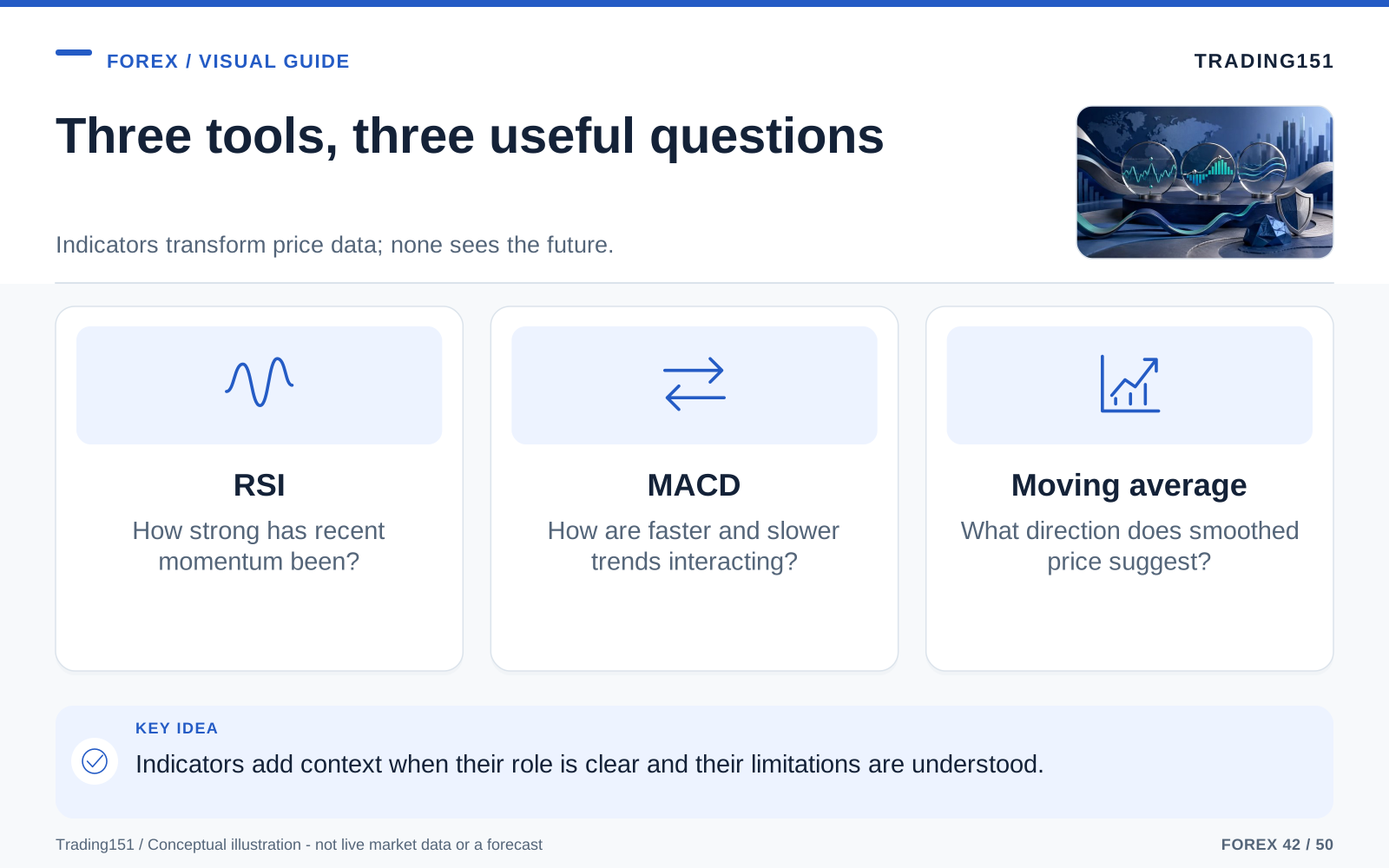
Read this diagram as text
- RSI
- How strong has recent momentum been?
- MACD
- How are faster and slower trends interacting?
- Moving average
- What direction does smoothed price suggest?
Part 2: RSI — Reading Momentum Without Losing Your Head
If Moving Averages are your compass for direction, the RSI is your speedometer. It measures how fast and intensely prices are moving, putting it firmly in the momentum category. But RSI acts completely differently depending on the market environment. In a raging bull market, it can stay high for ages, and pullbacks might only drop to the middle of the scale instead of hitting classic oversold levels. The reverse happens in a bear market. Learning to read the general zone the RSI is hanging out in is often way more useful than treating the 70 and 30 lines like magic reversal switches.
Developed by J. Welles Wilder, the Relative Strength Index swings between 0 and 100. Everybody knows the textbook rules:
- Above 70: Often described as overbought
- Below 30: Often described as oversold
Those labels are catchy, but they are also the source of a lot of blown trades.
What “Overbought” and “Oversold” Really Mean
New traders see "overbought" and think "it has to drop right now." They see "oversold" and think "time to buy." Markets just don't care about those rules.
When RSI crosses 70, the only thing it’s saying is that the recent upward move has been exceptionally strong. When it tanks below 30, it just means the sellers have been aggressively in control. That’s great context, but it is not a guaranteed pivot point.
Strong trends can stay stretched for an uncomfortably long time. Price can keep ripping higher while RSI sits stubbornly above 70, and it can keep tumbling while RSI is glued to the floor. Anyone who has ever tried to short a runaway market just because an indicator said "overbought" knows this pain intimately.
So, do yourself a favor: stop looking at RSI as a reversal button. Think of it as a gauge telling you whether a move is getting a bit stretched.
Why RSI Works Best With Context
RSI suddenly becomes a fantastic tool when you stop asking, "Is it past 70?" and start asking, "What is the overall market doing?"
In a strong uptrend, RSI usually treats the 40 or 50 level as a floor. It spends most of its time hanging out in the upper half of the chart. In a downtrend, it flips—struggling to get past 50 or 60 before the sellers take over again.
This makes RSI brilliant for timing pullbacks. Instead of waiting for extreme 30 or 70 readings, savvy traders watch how the indicator acts during a dip inside a bigger trend. A quick drop in the RSI during a bull run just means the momentum took a breather—not that the sky is falling.
The Mistake Beginners Make Most Often
The most common rookie mistake is treating every overbought reading like an automatic sell signal. It makes sense intuitively—if price has gone up that fast, surely it’s exhausted. But markets aren't about what's "fair." They run on order flow, positioning, momentum, and occasionally, pure panic.
Fading a strong RSI reading without thinking can cost you dearly. In a large rally, being overbought is a sign of underlying strength, not fragility. In a crash, being oversold just means the panic is still on.
This isn't a glitch in the indicator. It’s just a reminder that tools need a human brain behind them. Indicators describe the weather; they don’t tell you whether to go outside. You still have to look at the whole picture.
Divergence: Where RSI Gets Interesting
If you only take away one RSI trick, make it divergence. This happens when the price chart and the momentum indicator stop agreeing with each other.
- Bullish divergence: Price drops to a new low, but RSI makes a higher low. The market is still falling, but the sellers are losing their grip.
- Bearish divergence: Price pushes to a new high, but RSI makes a lower high. The market is climbing, but the engine is running out of gas.
Divergence isn’t a flawless crystal ball, but it’s a phenomenal early warning system. It hints that the market is getting tired before the price action makes it obvious.
Reversals almost never happen perfectly out of nowhere. There are usually tiny cracks in the ice before the whole thing breaks. RSI divergence is one of the best ways to spot those cracks.
Why Traders Keep RSI on Their Charts
People stick with RSI because it answers something price alone hides: How much force is behind this move?
Sometimes a breakout looks incredible, but the RSI reveals the momentum is totally hollow. Other times a chart looks like an absolute disaster, but RSI suggests the sellers have completely exhausted themselves. Having that second layer of insight is priceless, especially when you're trying to keep your emotions in check.
Part 3: MACD — A Bridge Between Trend and Momentum
The MACD has a way of intimidating new traders, mostly because the name—Moving Average Convergence Divergence—sounds like something out of a physics textbook. But since it’s just built from moving averages, it comes with the same lag and sensitivity issues. A crossover on a fast 5-minute chart might just be telling you about a move that already finished. It really shines when you decide exactly what you want it to tell you—are you looking to confirm a trend, spot a momentum shift, or watch for exhaustion? Figure that out first, rather than blindly trading every time the lines cross.
In the day-to-day grind, MACD is beloved because it tackles the two things traders care about most: trend and momentum. It doesn’t just say "price is moving." It tells you whether that move is stepping on the gas or hitting the brakes.
What You’re Looking At on a MACD Chart
A standard MACD has three main moving parts:
- The MACD line: This is simply the difference between a 12-period EMA and a 26-period EMA.
- The signal line: A smoothed-out average of the MACD line (usually 9 periods).
- The histogram: Those little bars growing above and below the middle line. They just show the distance between the MACD line and the signal line.
Sounds math-heavy, right? Don't worry about the formula. Once you see how it behaves visually, the math won't matter.
How Traders Read It
The bread-and-butter MACD setup is the line crossover.
- When the MACD line crosses above the signal line, traders view it as buyers waking up.
- When the MACD line crosses below the signal line, the bears are likely taking the wheel.
Then you have the zero line. If the MACD is above zero, it means short-term momentum is beating the longer-term trend. Below zero? The opposite is true.
A lot of traders pay close attention to whether the cross happens above or below the zero line. A bullish cross above zero is great for confirming an uptrend is still alive. A bullish cross below zero might mean a bottom is forming. They tell different stories, but both are useful.
The Histogram Deserves More Attention Than It Gets
It’s wild how many people stare at the MACD lines and completely ignore the histogram. That’s a mistake—the bars usually give away the plot first.
When the bars are getting taller, momentum is ramping up. When they start shrinking back toward the middle, momentum is fading. That doesn’t mean the market is going to U-turn right this second, but it does tell you the energy behind the move is shifting.
This is incredible for managing open trades. If you’re riding a nice trend but notice the histogram bars are shrinking, it might be a good time to tighten your stop loss, take some profits, or at least stop expecting the trend to go on forever. Price often loses steam long before it changes direction.
Where MACD Struggles
Like its Moving Average cousins, MACD suffers from lag. It reacts to what price already did, not what it’s about to do. If the market spikes violently, the MACD signal will show up late to the party. And in a choppy, sideways market? The lines will tangle up and hand you a frustrating string of fake-outs.
That doesn't make it a bad indicator. It just means it needs context. If the overall trend is obvious, and price has pulled back to a logical level, a MACD crossover is a beautiful entry trigger. But if you use it by itself in a dead market, you'll just be chasing ghosts.
Part 4: Why These Three Indicators Work Better Together
Here is the real secret: throwing three indicators on a chart doesn't mean you get three different opinions. Since Moving Averages and the MACD are built from the same price data, and RSI is reacting to those same moves, they will often tell you the same thing in three different ways. Real edge comes from true confluence—mixing market structure, price levels, and timing, and giving each indicator a highly specific job.
There is no single "ideal" indicator. Moving Averages are brilliant for direction, but they're slow. RSI is unmatched for spotting exhaustion, but it will lie to you during a mega-trend. MACD is great for momentum shifts, but it throws a fit in flat markets.
But when you team them up? They cover each other’s blind spots.
That’s why this trio is legendary. Each handles a different piece of the puzzle:
- Moving Averages show you the dominant trend.
- RSI tells you if the move is overextended or taking a breather.
- MACD gives you the timing when momentum shifts back in your favor.
When all three align and tell the same story, you have a setup worth taking seriously.
A Practical Example: Building a Simple “Triple Confirmation” Approach
Let’s say you want to buy a pair.
- Start with the trend: You see price is cruising above a rising 200 EMA. The bigger picture is bullish, so you shouldn't be trying to short every tiny dip.
- Wait for a pullback: Instead of jumping in blindly on a huge green candle, you wait. Price drops a bit. While it retraces, the RSI cools off from the 70s and drifts back down near 50.
- Look for momentum to return: The MACD lines curl upward, and the faster line crosses above the signal line. That's your cue. The pullback is likely over, and the buyers are stepping back in.
There’s absolutely nothing magical about this strategy. It’s not flawless. But it teaches you the most important lesson in trading: alignment.
The Moving Average keeps you from fighting the trend. The RSI keeps you from buying the absolute top. The MACD keeps you from entering while the pullback is still crushing you.
Trading like this is infinitely better than panic-buying every green arrow you see on a chart.
Confluence Reduces Noise
The hardest part of trading is doing absolutely nothing when there's nothing to do. Confluence fixes that. It acts like a bouncer, keeping low-quality setups out of your account.
If price is above the Moving Average, but RSI is maxed out and MACD is flatlining, maybe that setup isn't as beautiful as you thought. If RSI is oversold but price is tumbling below a steep Moving Average and MACD is bleeding out, that "cheap" entry is just a falling knife.
When multiple tools point the same way, you don't have to rely on your gut feeling.
Part 5: The Human Side of Trading With Indicators
We like to pretend indicators are purely mathematical, but honestly? They are psychological safety nets.
This matters more than anyone wants to admit. Trading is a mental grind. The moment real money hits the table, things get intensely personal. A chart that looked clean before you clicked "Buy" suddenly feels like a concerning trap. Normal pullbacks feel like the end of the world. The voice of doubt starts screaming in your ear.
This is where indicators save you. They give you a cold, hard framework to fall back on when your emotions are running hot.
Instead of sitting there sweating and thinking, "I just feel like this should go up," you can look at the data. Is price still above the trendline? Did the RSI reverse, or is it just resetting? Is MACD screaming sell, or is the trend fine?
It’s a tiny mental shift, but it’s everything. It pulls you out of the emotional brain and puts you back into a process-driven mindset.
The Danger of Indicator Overload
There is a fine line between a helpful dashboard and a total disaster area.
Every trader goes through this phase: you start with one indicator, take a loss, and bolt on another one to "fix" it. Six months later, your chart looks like a Jackson Pollock painting. It’s drowning in bands, clouds, squiggly lines, and arrows. At that point, the indicators aren't giving you an edge—they're just giving you paralysis.
A chart covered in spaghetti doesn't make you a better trader. It just gives you 50 different excuses not to place the trade.
The beauty of the "Big Three" is that they are enough. They don't predict the future, but they cover the big stuff: Trend. Momentum. Timing. That is realistically all you need.
Indicators Don’t Replace Risk Management
This is exactly where smart traders usually blow up. They will spend 50 hours a week obsessing over MACD settings, but won't spend five minutes figuring out their position size, where their stop goes, or how much capital they are risking.
Spoiler alert: the perfect setup will still fail. A central banker will say something unexpected. Inflation data will surprise the market. Liquidity will vanish at random. A perfect alignment of RSI, MACD, and Moving Averages cannot protect you from a random market shock.
That’s why risk management will always trump strategy. A mediocre strategy with iron-clad risk management will slowly make money. A genius indicator setup with reckless sizing will eventually blow your account to zero.
Part 6: Common Mistakes When Using RSI, MACD, and Moving Averages
Blaming an indicator for a bad trade is easy, but usually, the indicator isn't the problem. It’s how the trader used it. Here are the traps almost everyone falls into.
1. Treating every signal as a trade
Not every moving average cross is a buy. Not every 70 on the RSI is a sell. Pro traders are unusually picky. They don't just care whether a signal fired off; they care where and why it happened. Context is everything.
2. Ignoring the time frame
Seeing an oversold RSI on a 5-minute chart doesn't mean much if the 4-hour chart is in a large death spiral. You have to sync up your time frames. A setup is always infinitely stronger when the short-term signal aligns with the long-term trend, rather than fighting it.
3. Looking for certainty
This is the ultimate trap. Traders will waste years tweaking settings from 14 to 13, or 20 to 21, hoping to find the magic numbers that remove all risk. Let it go. Indicators do not give you certainty. They just help you make better guesses in a market full of unknowns.
4. Using indicators without looking at price
Indicators are supposed to back up your chart reading, not do it for you. Price is king. Support and resistance zones are still vital. An MACD cross floating in the middle of nowhere is basically worthless compared to one that happens right on a major daily support level.
5. Changing the plan after every loss
Every strategy on earth has losing streaks. A string of losses doesn't mean the indicator is broken. The fastest way to guarantee failure is to abandon your strategy the second you hit a rough patch. If you don't stick to a tool long enough, you'll never learn how it works.
Three indicators may be repeating the same information
A moving average smooths a selected series of past prices. MACD compares moving averages and uses a signal line, while RSI summarizes the relationship between recent gains and losses under its calculation. Because all three commonly draw on the same price history, agreement among them is not automatically independent evidence.
Treat overbought and oversold as indicator labels, not commands. A market can remain at an extreme reading while continuing in the same direction. Buying solely because RSI is low or selling solely because it is high therefore leaves the entry without a complete hypothesis about when the condition should reverse.
Settings involve a trade-off. A shorter lookback generally responds more quickly but can produce more changes, while a longer one smooths more history and reacts later. Neither is universally superior. Choosing the setting that best fits one historical chart can produce a result that does not survive another period.
Test an explicit use for each indicator. One might define eligible direction and another define timing, but the rule should also state when no trade is permitted and how it exits. Compare the result with a simpler version that omits an indicator. The most useful tool is not necessarily the one with the most signals; it is the one that improves a decision process you can explain and follow.
More indicators may repeat the same information
Several indicators derived from the same price series can agree without providing independent confirmation. A moving average, a momentum measure, and a trend oscillator may all respond to the same recent move. Know what each calculation adds before treating agreement as three separate pieces of evidence. A simpler set of tools can make the decision easier to explain and the strategy easier to test. 1, 2
Conclusion: Strong Tools, Realistic Expectations
RSI, MACD, and Moving Averages are the holy trinity of trading for a reason. They aren’t fancy, they aren’t new, and nobody is selling them for $997 in an exclusive webinar. But they continue to help regular people make sense of substantially chaotic markets.
Moving Averages show you the path. RSI tells you if the market is exhausted. MACD triggers the entry when momentum shifts. They aren't flawless, and they will absolutely give you bad signals sometimes. But combined, they create a highly effective framework that beats out the "secret indicator of the month" every time.
That’s the takeaway: they aren't magic wands. They are organizational tools. They force you to slow down, block out the noise, and base your entries on logic rather than adrenaline.
For most retail traders, that alone is a large edge.
If you are just starting your trading journey, keep it simple. Toss a moving average on your screen. Add the RSI. Slap on the MACD. Then, just watch. See how they react when the market is flying, when it pulls back, and when it goes dead flat. Stop hunting for a mythical custom setting, and spend that time learning how the standard ones behave when real money is on the line.
That deep familiarity is your real edge. Good trading rarely comes from finding a secret formula. It comes from looking at the same tools as everyone else, but using them with far more patience and discipline. Leave the settings alone long enough to see how they act in both good and bad markets. Save screenshots of the fake-outs, the late entries, and the trades that worked. An indicator only belongs on your screen if it helps you make a better decision. If you find yourself ignoring it, delete it. A clean, simple chart is almost always better than a complicated one.
Sources and further reading
Editorial revision: 7 October 2026. Numerical scenarios are hypothetical unless identified as historical. References support the added explanations and selected corrections; rules and product terms should be checked again before acting.