
A candlestick summarizes the open, high, low, and close for a chosen period. It does not reveal every trade or explain why participants acted. Patterns can provide a consistent way to describe price behavior, but their usefulness depends on the market, timeframe, execution costs, and the rules surrounding them. A recognizable shape is not a trade by itself.
Part 1: The Anatomy of a Candle
Before you can read the patterns, you have to know what a single candle is trying to tell you. Think of every candlestick as a quick summary of one specific trading period. That could be a minute, fifteen minutes, an hour, or a whole day. The basic structure is always the same; only the timeframe changes. (Keep in mind, depending on your broker and their server time, a four-hour candle might open at slightly different times on different platforms. So, don't get too obsessed with finding a textbook-perfect silhouette. Focus on the raw momentum or rejection it's showing.)
Every candle gives you four key pieces of info: the open, the high, the low, and the close. Put those together, and you get a surprisingly detailed story.
The Body
The thick, chunky part in the middle is the body. It just shows the distance between the opening and closing prices.
- Bullish candle: If the price closed higher than it opened, the candle is usually green or white. It means the buyers won that round.
- Bearish candle: If it closed lower, it's usually red or black, meaning the sellers took control.
A big, fat body means conviction. The price moved hard and stayed there. A tiny body means something completely different—hesitation, a tug-of-war, or a market that tried to go somewhere but just gave up before the clock ran out.
The Wicks, or Shadows
Those thin lines poking out of the top and bottom? Those are the wicks (or shadows). They show the absolute highest and lowest prices the market hit during that specific period.
- Upper wick: Shows how high the price pushed before pulling back.
- Lower wick: Shows how low the price dropped before recovering.
The wicks are where the real juice is. Long wicks scream rejection. A long upper wick means buyers tried to push the market up, but sellers aggressively slapped it back down. A long lower wick is the exact opposite: sellers tried to tank the price, but buyers stepped up and absorbed it all.
That’s why candlesticks are so great. They don’t just show you who won the game; they show you the bruises from the fight.
What One Candle Can Tell You at a Glance
Here is a simple, no-nonsense way to read a single candle:
- Big body, small wicks: Strong, one-sided pressure. Someone is definitely in charge.
- Small body, long wicks: Total indecision or a serious, messy fight.
- Long upper wick: Buyers tried to push higher and failed miserably.
- Long lower wick: Sellers tried to push lower and got rejected.
- Tiny body near the top of the range: Buyers pulled off a great comeback after an early drop.
- Tiny body near the bottom of the range: Sellers recovered well after the price briefly spiked.
Once you view them like this, the chart stops being a bunch of abstract shapes. Every bar becomes a mini emotional record of what traders were willing to fight for and where they completely lost control.
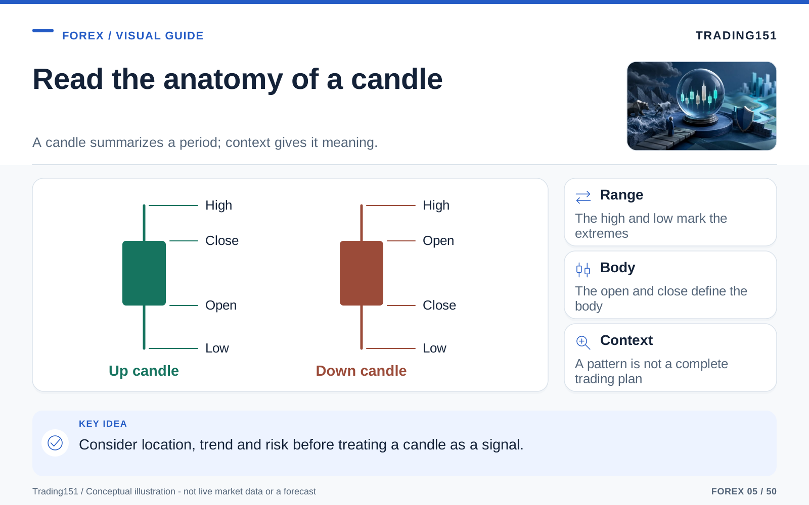
Read this diagram as text
- Range
- The high and low mark the extremes
- Body
- The open and close define the body
- Context
- A pattern is not a complete trading plan
Part 2: The Loners — Single Candlestick Patterns
Some candles are dramatic enough to steal the show all by themselves. A single candle can occasionally be your first real clue that a trend is dying, a breakout is failing, or the other side is starting to push back. But here's the catch: a solo candle only really matters when it interrupts an ongoing story. A hammer after a large crash means a lot more than a hammer chopping around in a tight, sideways market. It’s all about context. The shape shows you that behavior is shifting, but the location makes it tradeable.
The key word here is sometimes. No candle is a guaranteed crystal ball. Trend and location matter. But when these loners show up in the right spot, you'll want to pay attention.
The Hammer
A Hammer has a small body stuffed near the top of the candle and a long lower wick underneath it. You’ll usually spot it after the price has been falling.
So, what’s happening here? Sellers were completely dominating the session, pushing the price way down. But then, out of nowhere, buyers flooded in, erased almost the entire drop, and forced the price to close near its highs. That’s not just a minor bounce. It’s proof that heavy demand was waiting in the wings.
- Typical message: A sharp downside rejection.
- Most useful location: At the bottom of a decline, especially near a known support level.
- What traders look for next: A strong green candle right after it to prove the buyers are back.
Just keep in mind, a Hammer doesn’t guarantee a reversal. It just means the sellers didn’t get the easy win they thought they had.
The Hanging Man
The Hanging Man is basically the Hammer’s evil twin. It looks exactly the same, but you’ll find it at the top of an uptrend instead of the bottom of a downtrend. Same physical shape, completely different message.
When this guy shows up after a long climb, it’s a large warning sign. It tells you that even though the buyers managed to close the candle near the top, the sellers had enough firepower to drag the price way down during the session. The bullish trend is getting fragile.
- Typical message: The buyers are losing their grip.
- Most useful location: Near major resistance or after a huge, exhausting rally.
- What traders look for next: A bearish confirmation candle to signal the drop.
On its own, it's more of a yellow caution flag. It becomes a real setup when the next candle confirms the sellers are taking over.
The Shooting Star
A Shooting Star has a tiny body near the bottom and a large upper wick. You’ll usually see it after a strong run-up.
It’s a perfect visual of failed upward momentum. Buyers tried to keep the party going and push the price higher, but they just ran out of gas. Sellers completely hijacked the move and shoved the price back down to where it started.
- Typical message: An aggressive rejection of higher prices.
- Most useful location: Right at resistance or at the peak of a strong bullish run.
- What traders look for next: Bearish follow-through or a break below immediate support.
It gets its name because it flares up brightly and then just dies out. It's a very fitting image.
The Inverted Hammer
This one looks exactly like the Shooting Star, but you’ll find it after a downtrend. Again, context changes everything.
Here, that long upper wick means buyers finally threw a punch. They couldn’t hold the price up near the highs by the close, but the fact that they even showed up is a big deal. After a severe selloff, this is often the first whisper that the selling pressure is running dry.
- Typical message: Early signs of buying interest after a steep drop.
- Most useful location: Around major support levels.
- What traders look for next: A strong bullish candle to confirm the reversal is happening.
The Doji: When the Market Pauses
A Doji happens when a candle opens and closes at almost the same price. The body is practically non-existent, making it look like a cross, a plus sign, or a thin dash.
This is the market shrugging its shoulders. Nobody won. Buyers and sellers beat each other up for the entire session, only to end up exactly where they started.
- Typical message: Total indecision, hesitation, or a balanced tug-of-war.
- Why it matters: If you see one after a large, one-sided rally or crash, it tells you the momentum has suddenly hit a brick wall.
On its own, a Doji isn’t a trading signal. But after a long trend, it’s a huge hint that the side that looked invincible five minutes ago is suddenly hesitating.
Marubozu: Pure Conviction
A Marubozu is a large, chunky candle with practically no wicks at all. It's just pure, uninterrupted conviction.
- Bullish Marubozu: Buyers owned the entire session from the first second to the last.
- Bearish Marubozu: Sellers did the same thing on the way down.
These are great to see during breakouts because they show clean momentum. No hesitation, no nasty pullbacks. The market picked a direction and slammed the gas pedal.
Part 3: The Dynamic Duos — Two-Candle Patterns
Single candles give you hints, but two-candle patterns let you compare one session directly against the next to see exactly how power is shifting. That direct comparison usually gives you a much stronger signal.
Bullish and Bearish Engulfing Patterns
These are some of the most popular reversal patterns out there, and for good reason. They’re easy to spot and psychologically intense.
- Bullish Engulfing: Happens after a drop. You get a small red candle, followed immediately by a large green candle that completely "swallows" the previous one.
- Bearish Engulfing: The exact reverse at the top of a rally. A small green candle is entirely overshadowed by a huge red one.
The story here is super obvious. Whoever looked like they were in charge on the first candle gets absolutely destroyed on the second. It’s a very loud handover of power.
A Bullish Engulfing at support tells you the sellers pushed too hard and got ambushed. A Bearish Engulfing at resistance means the buyers ran out of steam and got slapped down. The bigger the engulfing candle, the more seriously traders take it.
The Harami
If the engulfing pattern is a shout, the Harami is a whisper. The first candle is big and strong. But the second candle is small, and its entire body fits inside the range of the first one.
It tells you that the fierce momentum from the first candle is quietly fading away. Volatility is shrinking. People are second-guessing themselves. That sudden quiet can be a huge tell, especially after a long run.
- Bullish Harami: Shows up at the bottom of a drop, hinting at a bounce.
- Bearish Harami: Shows up at the top of a climb, hinting at a pullback.
It’s not the most aggressive reversal signal, but it’s a fantastic early warning that a trend is running out of steam.
Tweezer Tops and Tweezer Bottoms
These happen when two back-to-back candles hit almost the same high or low and refuse to break past it.
- Tweezer Top: Two candles hit the same ceiling and get rejected.
- Tweezer Bottom: Two candles hit the same floor and bounce.
It’s very intuitive: the market tried to cross a line twice and got rejected both times. That double rejection usually highlights a very clear, stubborn support or resistance zone. Traders love Tweezers because they naturally line up with the exact levels everyone is already watching on the chart.
Part 4: The Storytellers — Three-Candle Patterns
Patterns that take three candles to form obviously require a bit more patience, but that extra time makes them super convincing. They tell a complete story: the push, the pause, and the pivot.
The Morning Star
This is a classic bullish reversal pattern you’ll find at the bottom of a downtrend.
- First, a nasty red candle shows sellers are dominating.
- Next comes a small candle (maybe a Doji) that shows hesitation—the momentum is stalling.
- Finally, a strong green candle surges upward, confirming the buyers have taken the wheel.
What makes this pattern so great is the emotional sequence. It’s not just a cute shape; it’s a real-time shift from panic, to doubt, to recovery.
The Evening Star
This is the exact opposite. You’ll see it at the top of a rally.
- A big green candle keeps the hype going.
- Then a small hesitation candle appears at the peak.
- Finally, a severe red candle smashes the price down.
Again, the story is what matters. Overconfidence melts into uncertainty, and uncertainty turns into a heavy selloff.
Three White Soldiers
This is a squad of three big, strong green candles in a row, each closing higher than the last, with barely any wicks.
It’s relentless buying pressure. When this marches in after a long downtrend or a boring sideways consolidation, it’s a strong sign the market isn’t just bouncing—it’s violently reversing.
Just be careful if you see this when the market has already been rallying for days; three large candles might just mean the latecomers are blindly chasing the price right before a nasty pullback.
Three Black Crows
The bearish version. Three heavy red candles stepping down, one after the other.
It shows persistent, grinding selling pressure rather than just a quick panic spike. It’s a great sign that a breakdown is real and gaining traction. But just like the Soldiers, context is key. If the market is already heavily oversold, the Crows might be showing up late to the party.
Part 5: Why Candlestick Patterns Work at All
This is the question every skeptical trader eventually asks: why should a few random blocky shapes matter in a multi-trillion-dollar market like Forex?
The answer is simple: candlesticks don’t predict the future. They just visualize human behavior. They take invisible market psychology and turn it into a footprint you can see.
Every candle is a snapshot of people making decisions under stress. Breakout traders chasing momentum, swing traders taking profit, institutions defending key levels, amateurs getting trapped. A candlestick compresses all of that chaos into something you can read in a couple of seconds.
A large upper wick just means the market completely rejected a higher price. A Bullish Engulfing candle means demand aggressively swallowed supply. A Doji after a huge rally means the buyers are suddenly second-guessing themselves.
There’s nothing magical or mystical about it. It’s just behavioral economics playing out on a screen.
The Self-Fulfilling Element
—There’s also a practical reality at work here. Millions of traders are staring at the same patterns you are. If a giant Bullish Engulfing candle forms at a major support level, a lot of people are going to buy simply because they know everyone else is buying too.
Does that make the pattern "fake"? Not at all. It just makes the market interactive. Trading is a psychological game, and candlesticks are just the shared language everyone uses to play it.
Part 6: The Trap — Common Mistakes That Hurt New Traders
Where most new traders blow up is treating candlestick patterns like an automatic ATM machine. The patterns are totally fine; the problem is treating them like blind triggers. If you place the trade before a candle closes, you're playing with fire. A gorgeous Hammer candle can turn into a nasty, full-bodied red candle in the last 30 seconds of an hour. Waiting for the close doesn't guarantee you'll win the trade, but it absolutely guarantees the pattern you're trading exists. This one rule will save you from an unbelievable amount of emotional, spur-of-the-moment decisions.
1. Ignoring Context
A Hammer in the middle of a choppy, messy sideways market means absolutely nothing. A Shooting Star floating in the middle of nowhere isn’t going to help you. Patterns only matter when they happen at real decision zones.
- Always ask first: Is this happening near support, resistance, a trendline, or a recent swing point that people care about?
A great pattern in a garbage location is just chart decoration. A good pattern in a great location is a tradeable clue.
2. Trading Before the Candle Closes
We've all done it, but it’s a classic rookie mistake. You see a perfect setup with five minutes left on the clock, you jump in early to get a better price, and then the candle morphs into something hideous right before the close. An almost-Hammer suddenly becomes a severe bearish bar.
- The golden rule: A candlestick pattern does not exist until the candle is officially closed.
Waiting can be boring, but it saves a lot of bad trades.
3. Using Tiny Timeframes as If They Carry the Same Weight
Sure, patterns happen on the 1-minute chart, but they’re buried under a mountain of random noise. The lower you go, the more erratic the price action gets. Higher timeframes carry way more weight because they represent real commitment from bigger players.
- General principle: A pattern on the daily chart is going to be infinitely more reliable than the same pattern on a 5-minute chart.
You can still trade the smaller timeframes, just don’t expect them to be as trustworthy.
4. Treating Patterns as Standalone Systems
Candlesticks are not a standalone trading system. They’re fantastic for timing your entry, but they need backup.
- Does the pattern line up with major support or resistance?
- Is the broader trend on your side?
- Is momentum slowing down or speeding up?
- Are your other tools (like moving averages or RSI) telling the same story?
Traders call this confluence. One clue is interesting. Four clues screaming the same thing is a trade.
5. Forgetting Risk Management
Even the most beautiful, textbook setup will fail sometimes. A news event drops, liquidity dries up, or the market just decides to do something weird. That’s just trading.
Being wrong isn’t a mistake—being wrong without a safety net is.
Before you take any candlestick trade, you need to answer these questions:
- Where exactly am I entering?
- Where am I proven wrong (stop loss)?
- How much money am I risking?
- What’s my logical target?
If the pattern gives you a gut feeling but no logical place to put your stop loss, you aren't ready to take the trade.
Part 7: Building a Simple Candlestick Workflow
Knowing the names of the patterns is easy. Using them without losing your shirt is the hard part. The secret is building a repeatable routine.
Step 1: Start With the Bigger Picture
Open the daily or 4-hour chart first. Is the market trending up, trending down, or chopping sideways? Draw your major support and resistance zones. You need to map out the battlefield before you start looking for individual skirmishes.
Step 2: Let Price Come to You
Forcing a trade because you're bored is a great way to lose money. Once your lines are on the chart, sit on your hands and wait for the market to reach them. Good trading is often more about patience than action.
You aren’t hunting for random patterns in the middle of nowhere. You’re waiting to see what happens when the price hits a zone that matters.
Step 3: Look for a Clear Reaction
When the price finally hits your zone, how does it react? Do you see a Hammer at support? An Engulfing candle at resistance? This is the market showing its hand.
It’s not a guarantee, but it’s the exact evidence you’ve been waiting for. The reaction tells you whether that level is holding or breaking.
Step 4: Wait for Confirmation
Wait for the damn candle to close. If it still looks good, you've got a valid setup. If the pattern falls apart at the last second, let it go.
It sounds ridiculously simple, but this one step filters out a large amount of market noise.
Step 5: Define the Trade
Now you turn that observation into a real plan.
- Entry: Usually after the close, or when the price breaks the high/low of the pattern.
- Stop loss: Tucked safely behind the wick or the structure level that invalidates your idea.
- Target: The next logical trouble spot, like the next support/resistance zone.
At this point, the candlestick is just the trigger. This step is your actual strategy.
Part 8: Which Patterns Matter Most in Real Trading?
Don't drive yourself crazy trying to memorize 50 different ancient Japanese candlestick names. You don’t need to. Most professional traders rely on a very small handful of patterns that they know inside and out:
- Hammer and Hanging Man
- Shooting Star and Inverted Hammer
- Doji
- Bullish and Bearish Engulfing
- Morning Star and Evening Star
- Tweezer Tops and Bottoms
Why these? Because they’re visually obvious, psychologically sound, and everyone respects them. You'll make way more money mastering five or six patterns than you will half-recognizing thirty of them.
Part 9: Practicing Candlesticks Without Fooling Yourself
There’s a smart way to practice this, and a way that will just build terrible habits. If you only look for perfect, textbook patterns that resulted in large wins, you're just tricking your brain. Real practice means looking at the ugly setups, the ambiguous candles, and the ones that totally failed. Mark your zones, cover up the right side of the chart, and move forward one bar at a time. A highlight reel only teaches you hindsight. A balanced, realistic sample teaches you which environments make a pattern worth trading.
A great exercise is to scroll back in your charts and map out key levels first. Then, as the price approaches those zones, pause and ask yourself:
- What’s the overall trend?
- What is this specific candle telling me?
- Are buyers rejecting this, or is momentum just stalling?
- What needs to happen on the next candle for me to take this trade?
Then hit the next button and see what happened.
Practicing in context is the only way to get better. It stops you from falling in love with every reversal candle you see. Some work flawlessly. Some fail immediately. That’s just the reality of the game.
And if you’re brand new, get on a demo account. Test how these patterns feel in real-time without donating your hard-earned cash to the market while you're still learning the ropes.
The same price movement can produce different candles
Two forex charts can show different daily candles even when both broadly reflect the same market. A provider's day may close at a different time, and its feed may show bid prices rather than midpoint or ask prices. That can change a candle's body, wick, and relationship to the previous candle. A pattern that looks exact on one chart may be less clear on another.
Keep that in mind when testing a rule. Record the data source, timezone, and price type, then use the same definitions throughout. State whether an engulfing pattern concerns the bodies or the full high-low ranges. Define how small a doji's body must be relative to its range. Without those details, two people can claim to test the same idea while counting different events.
Execution needs its own line in the test. A signal visible on a bid-price chart does not mean a buy can be filled at that bid. Include the spread and account for the fact that a completed candle is known only after the period ends. Entering at its earlier close without a realistic execution assumption can make a historical result too favorable.
The point is not to turn every chart observation into complicated mathematics. It is to remove enough ambiguity that you know what you are learning. A simple pattern with consistent definitions is easier to assess than a beautiful collection of examples selected after the move.
Read the candle in its trading context
The same candle shape can mean different things near a major release, during a quiet session, or after a large gap. Before assigning a signal, note the spread, recent volatility, and the surrounding price range. A visually striking bar is an observation, not an explanation. Consistent rules about context make a candlestick test more useful than collecting isolated examples that happened to precede a good move. 1, 2
Conclusion: Learning to Read the Market, Not Worship It
Candlestick patterns are incredible tools because they let you see the market thinking out loud. They show you the hesitation before a crash, the blind aggression of a breakout, and the total exhaustion of a dying trend. They give price action a pulse. That alone makes them worth your time.
But they only work if you treat them as clues, not commandments. A Hammer isn’t a promise that the market will reverse. An engulfing candle isn’t an excuse to ignore your stop loss. The best traders don't blindly obey patterns—they weigh the evidence.
Once you adopt that mindset, everything shifts. You stop seeing a wall of random, chaotic bars and start seeing a story unfolding in real-time: where buyers dug their heels in, where sellers panicked, and where the market made its choices.
That subtle shift moves you away from gambling and toward making calculated, thoughtful decisions.
So keep it simple. Pick a few patterns. Watch them on the higher timeframes. Pay attention to what they do around major levels. Take notes and review your charts. Over time, all that market "noise" starts to sound a lot like a clear, readable structure.
The goal isn’t to predict the future with 100% certainty. The goal is just to read the evidence in front of you better than the next guy.
In Forex, that simple edge is all you really need. Use candlesticks to time your entry and define your risk, but don't let them be your entire strategy. Read the whole context—the trend, the zone, the momentum—and use the candlestick as the final puzzle piece. The best pattern isn't always the prettiest one; it's the one that shows up exactly where it makes the most sense.
Sources and further reading
- BIS: April 2025 FX turnover, September 2025 preliminary release
- Wiley: Naked Forex, Alexander Nekritin and Walter Peters
Editorial revision: 7 October 2026. Numerical scenarios are hypothetical unless identified as historical. References support the added explanations and selected corrections; rules and product terms should be checked again before acting.