
Price-action trading uses the movement and arrangement of prices to guide decisions, often with few or no indicators. A simpler-looking chart can improve focus, but it does not make the interpretation objective by itself. Support, resistance, and candle patterns still need definitions. The real advantage of a clear method is that another person could understand when it would trade, when it would stay out, and how it would exit.
Part 1: What Price Action Means
Price action sounds a lot more mysterious than it is. When you strip away the jargon, it just means learning to read the chart yourself instead of outsourcing the job to a pile of indicators.
Markets move for one simple reason: buyers and sellers disagree on value. When one side gets more aggressive, the other pulls back, and the price changes. Every candle on your screen is a quick snapshot of that tug-of-war. A bullish candle tells you buyers had enough muscle to drive the price up. A bearish candle means sellers took the wheel. A large wick? Price tried to go somewhere and got violently rejected. Tight, tiny candles? Everyone is holding their breath. A large breakout? Someone finally made a move—or at least, they want you to think they did.
Price action traders read these footprints directly.
The underlying logic makes perfect sense. If all the world’s financial information eventually funnels into the price, then the price is the ultimate source of truth. Interest rate hikes, inflation reports, large institutional buy orders, political panic, greed, fear—they all leave their mark on the chart. You don't necessarily need to know the full backstory behind every move. Most of the time, you just need to know who's currently driving, where they’re likely to hit the brakes, and where the market might flip.
Now, this doesn't mean indicators are terrible or useless. They can definitely help some traders organize data. But remember, most indicators are derived from what price has already done. They react. Price action asks a much more urgent question: what is the market doing right this second?
Think of it this way: indicators are the sports commentators talking about the replay. Price is the actual game.
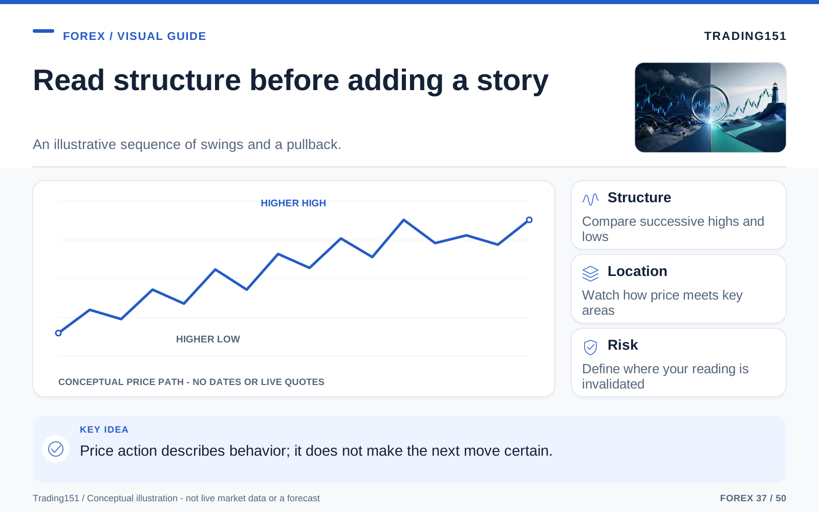
Read this diagram as text
- Structure
- Compare successive highs and lows
- Location
- Watch how price meets key areas
- Risk
- Define where your reading is invalidated
Part 2: Why So Many Traders End Up Simplifying
Almost everyone starts their trading journey by piling things on. More tools, more signals, more confirmation, more chart noise. It feels entirely logical—trading feels risky, so surely having more information will keep you safe, right?
When real money is on the line, the exact opposite usually happens.
Imagine this: your RSI is screaming "overbought," but your MACD says momentum is still climbing. A moving average crossover is telling you to buy, while a stochastic indicator is telling you to sit on your hands. Suddenly, you're paralyzed. You’re just staring at the screen, desperately waiting for five different squiggly lines to agree before the opportunity vanishes completely.
This is the quiet superpower of price action: it kills the conflict.
When you clear the clutter and just look at the raw chart, your questions become focused:
- What’s the market structure? Are we climbing, falling, or just bouncing around in a box?
- Where is the price right now compared to major levels? Are we at a key support, hitting resistance, breaking out, or just floating in no man's land?
- How is price behaving at this exact spot? Is it getting rejected? Stalling out? Slicing right through?
These are practical, actionable questions. They help you make a decision. And because they're based on what the market is visibly doing right in front of you, the whole process feels a hundred times cleaner than waiting for lagging indicators to magically align.
There’s another, more severe reason traders end up simplifying: price action forces you to be honest with yourself. A messy chart creates a false sense of security. A naked chart exposes whether you know how to read the market. You can’t hide behind a colorful dashboard when it's just you, the market structure, and the momentum.
Honestly? It feels scary at first. But eventually, it's the most liberating feeling in the world.
Part 3: The Chart as a Picture of Human Behavior
Even in an era dominated by high-frequency algorithms and trading bots, price action works because markets are still ultimately driven by human behavior. Greed, fear, FOMO, and panic all show up in predictable ways. You'll see traders chasing breakouts way too late, panicking at the exact bottom, desperately holding onto losing positions, or cashing out their winners entirely too early. The chart isn't logging motives; it's logging transactions. A large long wick could be a mix of profit-taking, a scary news headline, low liquidity, or a failed breakout. But here's the secret: you don't need to invent a perfect backstory for every candle. Your job is just to spot a recognizable reaction and act on it.
A chart is way more than just financial data. It's a visual diary of people making money decisions under intense pressure.
When you see a large bullish candle, you're seeing urgency. Buyers wanted in, and they were willing to pay a premium right now rather than wait. A long upper wick? That’s optimism getting slapped in the face. The price tried to rally, attracted some hopeful buyers, and then sellers slammed it right back down. See a tight little cluster of candles parked right under a resistance line? That’s tension. The market is knocking on the door, but sellers are holding it shut. Sooner or later, someone’s going to fold.
When you start viewing price this way, support and resistance finally make sense.
Support isn't some magical, invisible floor. It's just a price zone where, in the past, buyers decided the asset was cheap enough to aggressively step in and stop the bleeding.
Resistance is the same thing in reverse. It’s not a ceiling made of glass; it’s just an area where sellers previously decided the price was way too high and dumped their bags.
These areas matter because the market has a memory. Human traders remember them. Big banks remember them. Automated systems are programmed to react to them. Stop losses and pending orders clump up around them. That collective memory is what gives these levels their gravity.
The moment you stop looking at a chart as a bunch of random math and start seeing it as a psychological map of collective behavior, everything gets easier to read. Notice I said easier to read, not easier to trade—those are two very different beasts—but you’ll finally understand the story being told.
Part 4: The Three Foundations of Price Action
You really don't need a large playbook of twenty different concepts to be a great price action trader. You just need a few core pillars, understood deeply, and applied without fail. Pretty much everything else in trading is just a variation of three main things: structure, location, and behavior. And you have to read them in that exact order. Think about it—a random reversal candle chopping around in a messy range doesn't mean much. But that exact same candle forming at a major daily support level after a large drop? Now you have my attention. The pattern is identical, but the context changes everything. This is why veteran traders spend 80% of their time waiting for the price to reach a zone they care about, rather than hunting for a setup on every candle.
1. Market Structure
Before you even dream of looking for a trade entry, you need the lay of the land. Market structure tells you if the market is marching upward, sliding downward, or just wandering aimlessly sideways.
In an uptrend, the price will make higher highs and higher lows. Buyers keep claiming new territory, and when the price inevitably pulls back, they step in before it can drop below the last low. That’s the market telling you the buyers are actively defending their turf.
In a downtrend, flip the script. Lower highs and lower lows. Every attempted rally gets swatted down by sellers who are firmly in the driver’s seat.
Then you have a range. Nobody is winning. The price is just playing ping-pong between support and resistance, chewing up amateur traders who keep trying to trade a trend that simply isn’t there.
It sounds like day-one stuff, but you’d be amazed how often people ignore it. They zoom way in on a 5-minute chart, spot one pretty little candle, and completely forget to ask themselves: Wait, what kind of market environment am I trading in right now?
Asking that one simple question will save you from an unbelievable amount of bad trades.
2. Key Levels and Zones
If structure is your compass, levels are your map coordinates.
Smart price action traders don't just fire off trades randomly in the middle of nowhere. They patiently wait to do business at locations the market has already proven it cares about.
These hotspots generally include:
- Obvious support and resistance zones
- Recent major swing highs and swing lows
- Old resistance levels that have flipped to act as new support (and vice versa)
- The absolute top and bottom of a sideways range
- Big psychological round numbers (like hitting exactly 1.1000 or 150.00)
Pay attention to the word zone. Newbies love drawing paper-thin lines on their charts and get furious when the price doesn't reverse at that exact decimal point. Real markets are sloppy. Price will overshoot your line, stop short of it, poke through to trigger stops, and mess around inside the area. Treat these levels like fuzzy boundaries, not laser tripwires.
The more glaringly obvious a zone is, the more eyeballs are on it. It doesn’t mean the price is guaranteed to reverse there, but it dramatically increases the odds that something explosive is about to happen.
3. Candlestick Behavior
Structure gives you the big picture, zones give you the location, and candlesticks give you the play-by-play of what's happening right now.
A single candle won’t tell you the whole story, but it drops large hints. It shows you who won the last hour, whether a breakout was genuine or fake, if momentum is dying out, or if the tide has suddenly turned.
Please don't waste your time memorizing a dictionary of fifty different Japanese candlestick names. It’s so much more important to just read the raw emotion behind the shape.
Ask yourself what you're seeing:
- Did the price bounce off a level gently, or did it violently reject it?
- Did the candle close near its highs with authority, or did it look weak and exhausted?
- Did the market grind to a halt before changing direction?
- Does the move look natural, or forced?
- Is this little reversal fighting the large trend happening on the larger timeframe?
Understanding the underlying logic of a move is infinitely more valuable than pointing at the screen and shouting pattern names.
Part 5: The Candlestick Signals That Matter Most
You truly don’t need an encyclopedia of formations. The market tends to repeat a small handful of behavioral quirks over and over again. Master these, and you have the foundation of an potent strategy.
The Pin Bar
The pin bar is basically the market’s middle finger to a specific price level. It features a tiny body and a ridiculously long wick, which screams that the price pushed hard in one direction, only to get fiercely slapped back before the clock ran out.
A bullish pin bar has a long tail pointing down. Sellers tried to bury the price, but buyers absorbed every order and dragged it right back up. A bearish pin bar is the same story, just flipped upside down.
But here's the catch: a pin bar means absolutely nothing in a vacuum. It’s all about where you find it.
If you spot a bullish pin bar floating randomly in the middle of a choppy range, ignore it. But if you see that same bullish pin bar forming right as the price dips into a major daily support level during a large uptrend? Now we're talking. Context is what turns a random shape into a highly profitable signal.
The Engulfing Candle
Engulfing patterns are the market's way of shouting, "We're taking over!" In a bullish engulfing setup, you'll see a modest bearish candle followed immediately by a large bullish candle that completely swallows the previous one. It tells you the buyers didn't just show up—they kicked the door down and completely overwhelmed the sellers.
This is especially powerful when it happens right at a turning point or after a pullback. It proves the counter-trend move just hit a brick wall and lost control in the blink of an eye.
Again, don't get hung up on the textbook definition. Just read the room: whoever looked like they were in charge just got completely steamrolled.
The Inside Bar
An inside bar is a moment of total silence. It’s a candle that is entirely engulfed by the high and low of the candle right before it. It represents a pause, a moment of hesitation, or a temporary standoff between buyers and sellers.
It sounds boring, but inside bars are like coiled springs. When the market stops to catch its breath after a furious run, pressure builds up. When it finally breaks out of that tight little range, it usually snaps violently in the direction of the main trend. Alternatively, if you see an inside bar form right up against major resistance, it could mean the buyers are getting nervous right before a major reversal.
The trick isn’t to trade every inside bar you see. Just look for them in the right places. They're behavioral clues, not mindless "buy" buttons.
Breakout and Retest Behavior
Okay, technically this is a multi-candle sequence rather than a single pattern, but it's too important to skip. Price smashes through a major ceiling, rallies a bit, and then gently falls back down to "test" that exact same level from above. If the old ceiling acts as a new bouncy floor, the market usually shoots higher.
Why do we care? Because a retest proves the breakout was real. It wasn't just a random spike meant to hunt stop-losses. The market came back, double-checked the area, and decided it was legitimately solid ground. Buying on that retest is almost always a safer, lower-stress entry than desperately trying to chase the initial breakout candle.
Part 6: A Practical Way to Build a Trade
A huge reason beginners wash out is that they memorize patterns but totally lack a process. They can spot a beautiful pin bar from a mile away, but they have no idea if it’s worth risking money on. They draw support lines perfectly but freeze when the price gets there.
You can fix this instantly with a simple, three-step framework.
Think in three steps: context, location, trigger.
Step 1: Context
Always zoom out first. Daily and 4-hour charts cut out so much of the microscopic noise. Look at the big picture and ask yourself:
- Are we trending up, down, or stuck in a box?
- Where are the major swing highs and lows?
- Does the chart look smooth and intentional, or is it a jagged, unpredictable mess?
If the daily chart is screaming higher in a beautiful uptrend, you already know your game plan: wait for a dip and buy. Trying to be a hero and predict the exact top is just a quick way to lose money.
Step 2: Location
Draw your lines, but be picky. Don't highlight every little bounce on the chart—only mark the zones where the market has violently reacted in the past.
You are looking to do business where business makes sense. Buying at major support during a bull run? Smart. Buying a random green candle floating in the middle of a messy range? Gambling.
This is where patience pays the bills. The hardest part of trading is sitting on your hands and letting the price come to your zone instead of chasing it.
Step 3: Trigger
Once the price finally wanders into your trap, watch it like a hawk. How does it react? Does it violently bounce? Do you get a large engulfing candle? Does it try to push lower three times and fail miserably? These are your green lights.
You place the trade after the market proves your zone is holding. Not a second before.
Let’s tie it all together in a real-world example:
- The daily chart is clearly trending upward.
- The price pulls back perfectly into a prior resistance level that should now act as support.
- On the 4-hour chart, two red candles stall out at your line, followed by a large green engulfing candle.
- You buy the second that engulfing candle closes.
- You tuck your stop-loss safely below the lowest wick of that rejection.
- You aim for the next major resistance level, making sure your potential profit is well worth the risk.
It’s not rocket science. It's just a structured routine. And having a routine is the only thing that keeps you from clicking "buy" out of pure impulse.
Part 7: Why Higher Timeframes Usually Treat You Better
You can read price action on a 1-minute chart or a monthly chart, but —they aren't created equal. It's not that higher timeframes have some magical predictive power. They simply compress thousands of messy, noisy transactions into a single clean candle, giving you way more time to process what's happening. The catch? You need wider stop-losses, you'll find fewer setups, and you have to hold trades overnight. But you should pick a timeframe because it fits your lifestyle and strategy, not just because it sits higher on the platform menu.
The further you zoom in, the more junk data you have to filter out. Drop down to a 3-minute chart, and a single large institutional order can create a large, dramatic-looking candle that completely reverses five minutes later. A lot of those microscopic setups are just algorithmic noise, spread fluctuations, or quick liquidity grabs.
Higher timeframes might be painfully slow for adrenaline junkies, but they rarely lie to you.
A pin bar on a daily chart means buyers and sellers fought an exhausting 24-hour war, and one side definitively lost. A similar shape on a 3-minute chart just means a few bots swapped algorithms while you were grabbing coffee. The higher timeframes give the market enough time to reveal its true intentions.
This is why so many seasoned price action traders gravitate toward the 4-hour and daily charts. Sure, they take fewer trades. But the setups are clean, their stress levels are almost zero, and they aren't glued to their monitors all day long.
If you’re struggling right now, just bump your timeframe up a few notches. It might not instantly make you profitable, but it will definitely save your sanity.
Part 8: Common Mistakes That Make Price Action Look Worse Than It Is
People love to say price action is simple, which is true. But simple does not mean easy. A lot of traders claim they "trade price action" when all they're doing is hunting for random candlestick shapes and praying they work out.
That’s not trading. That’s pattern collecting.
If you want to avoid joining the crowd of traders who fail, watch out for these classic traps.
Trading the Signal and Ignoring the Context
A textbook-perfect engulfing candle parked in a terrible location is still a garbage trade. It’s so easy to get hypnotized by a beautiful pin bar and completely forget to check if you're trading with the broader trend.
The candle itself isn't the setup; the candle plus the location is the setup.
Drawing Too Many Levels
If your chart looks like a neon zebra crossing, your lines are actively hurting you. High-quality levels are glaringly obvious. They are the major peaks, the deep valleys, and the heavy ceilings. If you draw a line at every minor hiccup in price, you’ll be too paralyzed to take a trade when a real setup forms.
Entering Too Early
FOMO is a portfolio killer. So many traders see a pin bar starting to form and click "buy" before the hour even closes, terrified of missing out. Half the time, the market instantly reverses, the candle closes as a large red block, and they're trapped in a terrible trade they never should have been in.
Let the candle close. Make the market commit first.
Forcing Trades in Dead Conditions
Some markets move like poetry. Others move like a drunk walking down a flight of stairs. When the price is endlessly chopping sideways, overlapping itself, and ignoring support levels, you have no edge. A professional price action trader has no problem looking at the screen, saying, "This looks like garbage today," and walking away.
Ignoring News Risk
Even the purists who trade 100% naked charts know that real-world news matters. Central bank rate hikes, nasty inflation surprises, and geopolitical shocks don't care about your perfectly drawn support line. Price action helps you read the sentiment, but it won't act as a shield against a sudden, violent news spike.
Part 9: Risk Management Is What Keeps the Whole Approach Honest
Nobody wants to read the risk management section, but it is the only thing keeping you in the game. Naked chart reading is highly discretionary, which means you need rigid rules to keep yourself from spiraling. Before you even think about entering, you need to know exactly where your idea is officially proven wrong, exactly how much money that mistake will cost you, and if there's any upcoming news that might blow past your stop-loss. Take a screenshot of the setup right when you enter. When you look back at it later, it’s the only way to know if you followed a strict process or if you just made up a story because you wanted to click a button.
Let’s be very clear: price action is not a crystal ball. It doesn’t let you see into the future. All it does is highlight areas where the odds are tilted in your favor. Having an edge is amazing, but it doesn't mean you're going to win every time.
You can do everything flawlessly. You can trade with the trend, wait patiently for price to hit a daily support zone, get a gorgeous rejection candle, enter perfectly—and still get stopped out. That’s just trading. The market doesn't owe you a win just because your chart looked pretty.
Because of this, risk management isn’t some optional safety net. It is the core of the entire business.
Stick to these unshakeable rules:
- Always know exactly where your setup is invalidated. That exact spot is where your stop-loss goes. No exceptions.
- Risk a tiny, boring percentage of your account per trade. Stop trying to get rich by Friday. Risk an amount you could lose five times in a row without breaking a sweat.
- Never, ever widen your stop-loss mid-trade. Moving your stop because you "just have a feeling it'll bounce back" is how accounts die.
- Check the reward-to-risk ratio. If your target is only 10 pips away but your stop is 30 pips wide, the math is against you. Skip it.
A mediocre chart reader with elite risk management will survive and eventually thrive. A brilliant chart reader with sloppy risk management is just a ticking time bomb.
It sounds harsh, but it’s the reality of the game.
Part 10: What a Clean Chart Really Gives You
People always talk about naked charts like they’re just aesthetically pleasing. But the real benefit isn't visual at all—it's psychological. A clean chart fundamentally rewires how you think about the market.
When you strip away all the blinking lights and overlapping lines, you have no choice but to focus on what drives price: market structure, momentum, and human reaction. You stop treating a squiggly line at the bottom of your screen as the ultimate authority, and you start developing your own intuition.
It also makes patience infinitely easier, simply because there are fewer fake signals begging for your attention.
A cluttered screen will trick your brain into finding a reason to trade, even when there isn't one. A clean screen refuses to lie to you. If a setup looks weak and confusing on a naked chart, it’s because it is weak and confusing. Recognizing that saves you money.
Eventually, this strips all the frantic anxiety out of your trading. You stop trying to predict every little zigzag. Instead, you just sit back, wait for the puzzle pieces to snap together into a logical picture, and execute your plan without a drop of adrenaline.
That inner calm is the best part of price action trading. It doesn't just make you a better analyst; it makes you a colder, sharper decision-maker.
Part 11: How to Practice Without Burning Yourself Out
There’s no secret hack here: you only get better at reading price action by looking at thousands of charts. But you don't have to torture yourself in the process.
The absolute best way to train your eye is to scroll back through historical data.
Pick a random point in the past and start asking yourself:
- Where was the overall trend painfully obvious?
- Which support and resistance levels clearly dictated the market's boundaries?
- When the price hit those levels, what did the rejection look like?
- Why did a specific engulfing candle lead to a large win? (Hint: check the broader context).
- Why did that "perfect" pin bar fail instantly? (Hint: it was probably fighting the trend).
This type of back-testing is powerful. You stop seeing textbook shapes and start recognizing organic human behavior. You’ll eventually develop a gut feel for the difference between a natural pullback and a dying trend, or a healthy breakout versus an exhausted trap.
Keeping a journal is mandatory, but make it useful. Don’t just write down entry and exit prices. Write down the why. What was the bigger structure doing? Why did you pick that specific zone? What was your trigger? If the trade had gone against you, at what exact price would your logic have been proven wrong?
Reviewing those kinds of details will sharpen your edge ten times faster than just obsessing over your win rate.
Part 12: The Real Skill Isn’t Prediction. It’s Interpretation.
Everyone comes into this industry hunting for certainty. They want a secret candlestick pattern that never fails, a moving average combo that predicts the future, and a rigid system that forces the chaotic market to behave.
I'll save you years of frustration: price action doesn't offer that.
What it does offer is far more powerful: it teaches you how to interpret reality as it unfolds.
It trains you to read real-time pressure instead of gambling on absolute certainty. You learn to map out different scenarios rather than clinging to stubborn predictions. You stop staring at the screen asking, "What is this market definitely going to do next?" and start asking, "What is this market doing right now, and what is the smartest, lowest-risk way for me to react?"
That mental shift changes everything. It pulls you out of the stressful game of fortune-telling and drops you into the professional world of observation, planning, and precise execution.
And over the long haul? That’s exactly what builds a resilient, patient trader who survives the inevitable losing streaks without losing their mind.
A clean chart still needs a complete rule
Choose a single pattern and describe it without referring to the result that followed. Define the relevant high or low, the number of bars considered, and the point at which a signal becomes complete. "Price rejected the level strongly" may sound clear while leaving room for different judgments on every chart.
Keep the entry and invalidation separate. A level can be relevant without offering a trade at the current price, especially if the necessary exit is far away. Chasing a move after it leaves the area can change the expected reward relative to the risk even when the original observation was reasonable.
Account for the feed. Spot forex prices differ across providers, and session boundaries affect how candles are assembled. A pattern visible on one chart may be absent on another. Record the source and settings when testing or reviewing a setup so that disagreements do not get mistaken for mysterious market behavior.
Evaluate both successful and unsuccessful examples under the same definition. A tidy chart annotated after the event is useful for explanation but weak evidence of predictive ability. The method becomes more informative when it can be followed prospectively and compared with a simple baseline. Removing indicators removes visual clutter; it does not remove uncertainty, costs, or the need to test the decision process.
Make the invalidation observable
A price-action idea needs a condition under which it is no longer the same idea. Define that condition using information the trader can observe at the time, rather than an explanation that becomes obvious only afterward. A closing-price rule, an intrabar level, and a time-based exit are different choices.
The definition will not prevent losses. It makes the trade reviewable and helps separate a planned loss from an improvised decision to keep holding. Without that distinction, every losing trade can acquire a new story while the original reason for entry disappears. 1, 2, 3
Conclusion: Learning to Hear What the Chart Is Saying
Mastering price action is a lot like learning how to follow a conversation in a crowded, noisy room. At first, it's just a wall of sound. Every candle looks important. Every minor dip feels like a large opportunity. Every tiny spike looks like a breakout. But slowly, your eyes adjust. You start filtering out the static and tuning into the signals that matter.
You realize the chart isn't just random chaos. It breathes. It has a rhythm. You start spotting the zones where the big players do business. You recognize the subtle moments when the buyers run out of gas and the sellers take the wheel. You learn the difference between a candle that’s telling you a genuine story, and a candle that's just a bunch of algorithmic noise wearing a scary mask.
That’s the moment price action finally clicks.
It’s not that the market suddenly becomes a breeze to trade. It’s just that the chart stops looking like a frantic mess of red and green lines, and starts reading like a beautifully written language.
If you're used to trading with an instrument panel that looks like a fighter jet, I challenge you to try this: save your current template, open up a totally blank chart, and draw nothing but the major swing highs, swing lows, and obvious support/resistance zones. Then, just sit back and watch. Watch how the candles close around those lines. Watch the long wicks. Watch momentum die and explode. Watch who keeps winning the battles.
In the beginning, it’s going to feel way too simple to work. Stick with it anyway.
More often than not, the clarity you've been desperately searching for was sitting right there the whole time. It was just buried under a mountain of useless indicators. A truly clean chart shouldn't give you hundreds of trading opportunities; it should give you a few highly calculated ones. Mark the zones that truly matter, let the price show its hand, and get comfortable with the fact that on some days, there’s simply nothing worth trading. Price action is beautiful because it forces you to observe and restrains you from overtrading. Just remember: it's a tool for clarity, not a crystal ball for certainty. Keep it simple, manage your risk, and let the market tell you what it wants to do.
Sources and further reading
- CFTC: Eight things to know before trading forex
- TradingView Pine Script Documentation: Strategies
- BIS: April 2025 FX turnover, September 2025 preliminary release
Editorial revision: 7 October 2026. Numerical scenarios are hypothetical unless identified as historical. References support the added explanations and selected corrections; rules and product terms should be checked again before acting.