
Multiple timeframe analysis looks at the same market over different intervals, usually combining a broader context with a more detailed entry or exit view. It can help organize decisions, but it can also produce conflicting signals or opportunities to justify almost any trade. The method becomes useful only when each timeframe has a defined role and the rules respect what information was available at the moment of entry.
What Exactly Is Multiple Timeframe Analysis?
Put simply, Multiple Timeframe Analysis just means looking at the same currency pair on more than one chart before you risk any money.
Instead of hyper-focusing on just the 1-hour or 15-minute chart, you use a few connected timeframes to answer different questions. One chart tells you the overall trend. Another shows you exactly where the price sits within that trend. A third helps you figure out if right now is the right time to place the trade.
This matters way more than beginners think. Markets aren’t flat lines. They move in complex layers. A pair can be substantially bullish on the weekly chart, pulling back on the daily, chopping sideways on the 4-hour, and falling on the 15-minute—all at the same time. None of those charts are "wrong." They just don't tell the whole story on their own.
Think of MTFA like using a maps app on a long road trip.
You need the zoomed-out view first to know if you're heading North or South, and which highways to take. But that eagle-eye view isn’t enough to drive the car. If you never zoom in, you're going to miss your exit, ignore local traffic, and end up in a ditch.
Now flip it. If you stay zoomed all the way in on street-level the entire trip, you'll see every pothole, but you'll have zero sense of direction. You could drive flawlessly through a neighborhood and still end up three states away from your destination.
That’s exactly what happens to single-timeframe traders. They either get lost in the microscopic noise or they get so obsessed with the big picture that they have terrible entries and blown-out stops.
MTFA bridges that gap. It connects the what, the where, and the when.
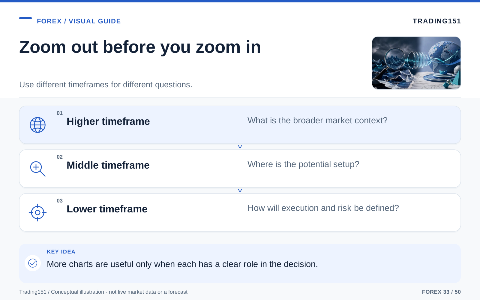
Read this diagram as text
- Higher timeframe
- What is the broader market context?
- Middle timeframe
- Where is the potential setup?
- Lower timeframe
- How will execution and risk be defined?
Why a Single Timeframe So Often Leads Traders Astray
Staring at one chart isn't a crime. The danger is treating that single chart like it’s the absolute truth.
Forex is inherently noisy. It reacts to macro news, interest rates, bank positioning, random headlines, algos, and millions of retail traders clicking buttons. Price almost never moves in a straight, clean line. Even the strongest trends are packed with fake-outs, pullbacks, stop hunts, and ugly consolidations.
When you live on just one timeframe, you’re only seeing one small slice of reality. Sometimes that slice is helpful. Other times, it's a complete lie.
This is why a 5-minute breakout can look gorgeous but fail instantly. It’s why a bullish engulfing candle on the 1-hour chart means absolutely nothing if it’s slamming right into a large weekly resistance level. You can feel entirely "right" in the moment and still get crushed because you were on the wrong side of the larger tide.
MTFA won't make the market perfectly predictable—nothing will. But it will stop you from making bets while wearing a blindfold.
1. The Market Is Fractal, but Not All Signals Carry Equal Weight
You’ll see the same patterns repeat at every level in Forex. Head and shoulders, flags, breakouts, and ranges exist on the monthly chart just as they do on the 1-minute chart.
This repeating nature is what people mean when they say the market is fractal.
But here’s the catch: not all fractals matter equally. A support level that has held up for six months on the Daily chart is infinitely stronger than a tiny support shelf that formed during twenty minutes of sloppy lunch-hour trading. Bigger timeframes have more money, more history, and more weight behind them.
Small charts are great for fine-tuning, but they shouldn't be making the big decisions for you.
2. It Helps Separate Real Structure from Random Noise
Fast charts lie. A 15-minute chart can look violent and emotional, full of large swings that feel urgent. But toggle over to the 4-hour chart, and you'll see the price is just slowly drifting in a perfectly normal, healthy pullback.
That perspective is a lifesaver. It stops you from panic-selling every time the price flickers. It helps you realize that everyday volatility isn't always a structural shift. Most of the time, the big picture hasn't changed at all.
3. Better Context Usually Leads to Better Entries
The best part of MTFA is how it blends patience with sniper-like precision. The big chart tells you what to trade. The small chart tells you when to jump in.
This does wonders for your risk-to-reward ratio. Instead of blindly chasing a fast-moving candle, you wait for the price to drop into a major higher-timeframe zone, and then you drop down to a small chart to find a tight, low-risk entry.
Sure, it doesn't guarantee a win. But it guarantees your trade makes logical sense from multiple angles.
4. It Can Calm the Emotional Side of Trading
Traders don't blow accounts because they don't know what a trendline is. They blow accounts because they panic, hesitate, revenge trade, and throw their rules out the window the second the screen flashes red.
Context is the ultimate cure for panic.
When you know your long position aligns with the daily trend and you bought at a major weekly support level, a sudden 10-pip drop on the 5-minute chart doesn't scare you. You still respect your stop loss, obviously. But you aren't emotionally yanked around by every tick.
That mental calmness isn't just a bonus. It is the difference between an amateur reacting to the market and a professional executing a plan.
The Rule of Three: A Simple Way to Structure Your Analysis
Once people discover MTFA, they usually fall into a new trap: they open way too many charts. To fix this, your timeframes need specific jobs and enough distance between them. If they are too close, they just show you the same noise. If they’re too far apart, the macro chart is useless for your actual trade duration. So figure out how long you plan to hold the trade, then pick a context chart, a setup chart, and an execution chart that match.
Otherwise, traders look at the monthly, weekly, daily, 4-hour, 1-hour, 15-minute, and 5-minute charts all at once. Suddenly they have seven conflicting opinions and total analysis paralysis. One chart says buy, another says sell, another says wait, and the whole thing becomes exhausting.
A simple Rule of Three keeps things clean and consistent.
Instead of watching every interval your broker offers, stick to three connected timeframes. A good rule of thumb is that each chart should be roughly four to six times larger than the one below it. This creates enough space to give each chart a unique purpose without fragmenting your brain.
You'll typically use these three charts for three very specific jobs:
1. The Long-Term Chart: Your Compass
This chart gives you the absolute macro direction. Are we in an uptrend, a downtrend, or just stuck in a messy range? Where are the giant walls of support and resistance? Is the market stretched way too far, or is it winding up for a move?
You are not timing your entries here. You're just checking the weather so you don't walk out into a hurricane.
If the macro chart is heavy and bearish, that doesn’t mean you can never take a long trade. It just means buying is swimming upstream. For most of us—especially newer traders—this chart is a filter. It tells you what not to fight against.
2. The Medium-Term Chart: Your Map
This is where the actual trade idea starts breathing. It helps you see the current structure inside that bigger macro trend. Is the market forming a nice, clean pullback? Is it testing an old breakout zone? Or is it printing lower highs, warning you that the trend is dying?
Think of your map as the bridge between the big picture and the exact entry point. It pinpoints where you are in the story right now.
3. The Short-Term Chart: Your Magnifying Glass
This is where you place the trade. The compass gives you the direction. The map gives you the neighborhood. The magnifying glass gives you the exact house.
Down here, you're hunting for a micro break of structure, a nasty rejection wick, an engulfing candle, or whatever your specific trigger is to prove momentum is stepping back in your direction. The golden rule here? You aren’t asking the small chart to invent a trade idea. You’re only asking it to optimize your entry.
How to Choose the Right Timeframe Combination for Your Style
There is no "ideal" combination of timeframes. The right setup depends entirely on how you trade, how much screen time you have, and how long you can stomach being in a trade.
If you only check your charts twice a day after work, you shouldn't be using the same timeframes as a guy who day-trades the London open. If you hate sitting at a desk, don't force yourself to scalp the 1-minute chart just because some guy on social media makes it look cool.
Here are a few sensible combos based on different styles:
The Scalper: Fast, Focused, and Highly Selective
Scalpers live inside tiny price swings. They need speed, hyper-focus, and a great read on immediate momentum.
- Long-Term (Compass): 1-Hour chart
- Medium-Term (Map): 15-Minute chart
- Short-Term (Execution): 1-Minute or 5-Minute chart
The big chart still matters for a scalper, but precision is everything. Because spreads, commissions, and milliseconds matter at this speed, extreme discipline is required.
The Day Trader: Looking for the Core of the Session Move
Day traders want a meaty, intraday move, but they want to sleep flat—no overnight risk. Mid-range charts hit the sweet spot here.
- Long-Term (Compass): Daily chart
- Medium-Term (Map): 4-Hour chart
- Short-Term (Execution): 15-Minute or 1-Hour chart
This is the most popular combo for a reason. It perfectly balances macro context with enough daily volatility to catch a move.
The Swing Trader: Patient and Bigger-Picture Oriented
Swing traders don't care about the 5-minute noise. They want to grab huge directional swings that take days or weeks to play out.
- Long-Term (Compass): Weekly chart
- Medium-Term (Map): Daily chart
- Short-Term (Execution): 4-Hour chart
If you want fewer choices, wider stop losses, and a life away from the screens, this is for you. It naturally cures the urge to micromanage your trades.
How to Apply Multiple Timeframe Analysis Step by Step
The easiest way to grasp MTFA is to watch it happen in real time. A great mental trick is to think of it like writing one sentence for each layer. The highest chart defines the weather. The middle chart spots the location. The lowest chart pulls the trigger. If you look at a chart and it doesn't give you a new piece of the puzzle, toss it out. This stops you from randomly clicking through timeframes until you find one that validates your urge to trade.
Let's say you're day trading GBP/USD. Your core trio is the Daily, the 4-hour, and the 15-minute.
The absolute golden rule is this: start at the top and work your way down.
Doing it in that order matters. It prevents your macro bias from being hijacked by a wild 15-minute candle.
Step 1: Start with the Compass on the Daily Chart
You fire up the Daily chart and look back a few weeks. The market is printing higher highs and higher lows. Every time it drops, buyers step in. It's coasting nicely above your moving averages, and there's no major sign of the bears taking over.
Your conclusion is simple: we are bullish.
This doesn't mean you smash the buy button right now. It just means shorting is a terrible idea unless something drastically changes. Your only job now is to find a logical place to hop on the bullish train.
Most traders would see their win rate jump overnight if they just applied this single filter. Stop trying to trade every squiggle on the screen and start filtering out trades that fight the daily trend.
Step 2: Move to the 4-Hour Chart and Read the Structure
You drop to the 4-hour chart. You notice the price has been sliding backward for a couple of sessions. If you only looked at this chart, it might look bearish. But because you checked the Daily, you know it’s just a routine pullback in a bigger uptrend.
Now you can start asking the right questions.
Is this dip falling into an old resistance zone that might act as support? Is it tapping into a fair value gap? Is the downward momentum drying up, hinting that sellers are exhausted?
You spot an obvious old breakout zone that perfectly aligns with a 4-hour support level. You draw a box on your screen and you sit on your hands.
You aren’t predicting the future here. You’re setting a trap. The market has walked right into an area where a bullish reaction is highly probable.
Step 3: Drop to the 15-Minute Chart for Timing
Eventually, the price taps your box. You zoom in to the 15-minute chart to watch the micro-battle unfold.
You don’t buy just because the price hit the line. You want proof that buyers care about this level. Maybe the sellers try to push it lower and fail, leaving a huge rejection wick. Maybe a large green engulfing candle prints. Maybe a tiny downtrend structure finally breaks to the upside.
Once you get that hard proof, you execute.
You tuck your stop-loss safely below the 15-minute structure that just formed. You set your target based on the 4-hour chart—maybe the previous swing high.
Now, look at what you’ve built. Your trade has three solid pillars of logic:
- The Daily chart gave you a clear directional bias.
- The 4-hour chart gave you a highly logical location.
- The 15-minute chart proved the timing was right.
That is MTFA in action. It’s not a magic crystal ball, but it’s a hyper-logical, stress-free way to build a trade based on actual market context, rather than raw impulse.
What Strong Multiple Timeframe Analysis Really Looks Like
A lot of guys think MTFA means glancing at the daily chart for three seconds before slamming a 5-minute market order. Real analysis requires a little more intent than that.
You are trying to build a cohesive story. A good internal monologue looks something like this:
The weekly trend is up. The daily chart is pulling back into a previous breakout zone. The 4-hour shows sellers losing steam as they hit support. I only want to buy. I am just waiting for the 15-minute chart to flip bullish before I click the button.
Compare that to: “Whoa, the 5-minute chart just printed a large green candle! I better buy before I miss it!”
The first way creates discipline and structure. The second way creates anxiety, random trades, and a blown account.
When your charts align, trading feels... Boring. In a good way. You aren't forcing the market to give you a setup. You let the big chart set the stage, and you use the small chart purely as a sniper rifle.
When the Timeframes Don’t Agree
Here’s a large lesson MTFA will teach you: sometimes the best trade is closing your laptop. Disagreement between charts is a huge red flag. It usually means a smaller trend is fighting a bigger trend, or the market is just churning in a messy transition. Figure out your rules beforehand: do you trade against the trend under strict conditions, or do you step away entirely? What you shouldn't do is just keep flipping through charts until you find an excuse to trade.
If the weekly is crashing, the daily is stuck in a sideways box, the 4-hour is aggressively rallying, and the 15-minute is whipping around like crazy, there is no story. There is just noise, chaos, and a great way to lose money.
Too many traders see that mess and view it as a puzzle they have to solve. But veteran traders see it for what it is: a giant "DO NOT ENTER" sign.
Perfect alignment is rare. Markets are messy. But you absolutely need the higher and lower charts pointing in the same general direction. If they are at war with each other, you are just gambling.
Ultimately, MTFA isn't just a radar for finding good trades. It’s a shield for blocking terrible ones.
Common Mistakes Traders Make with Multiple Timeframe Analysis
MTFA is a superpower, but only if you don't lie to yourself. Here are the classic ways traders mess this up.
1. Starting from the Lowest Timeframe and Working Backward
This is the number one killer.
You spot a fast, sexy move on the 5-minute chart. The FOMO hits. You desperately want an excuse to take the trade, so you zoom out to the 4-hour chart just to look for anything that validates your urge. You draw sloppy trendlines. You imagine support levels. You talk yourself into it.
That isn't analysis. That’s just making up excuses to scratch an itch.
The fix: Always, always start at the top. The big chart dictates the bias before the small chart is even allowed to speak.
2. Watching Too Many Charts
More screens do not equal more profit. Usually, they just equal more confusion.
If you open a new timeframe every time you feel unsure, you will always find a reason to buy, and you will always find a reason to sell. It paralyzes you.
The fix: Pick your three timeframes, lock them in, and spend time learning how those specific intervals interact.
3. Treating Lower Timeframe Signals Like They Override Everything
A pretty hammer candle on the 15-minute chart does not destroy a large daily resistance zone. A fast 5-minute dump doesn’t mean the weekly bull market is over.
Small-chart signals are only powerful when they happen in the right place, at the right time. Otherwise, they're just tiny blips of noise pretending to be important.
The fix: Always ask: "Does this 5-minute move make sense within the 4-hour story?" If the answer is no, pass.
4. Entering Too Early Just Because Price Reached a Level
Lines on a chart aren't concrete walls. Price can tap a daily support zone, hesitate for a minute, and then crash right through it. Too many people perfectly identify a higher-timeframe level, but then they blindly place limit orders and get run over.
The fix: Wait for the small chart to prove that the market respects the zone. The level matters, but the reaction to the level matters more.
5. Managing the Trade on a Much Smaller Timeframe Than the One Used to Enter
This is where traders lose their minds. You enter a beautiful trade based on a 4-hour setup. But the moment you are in, you switch to the 1-minute chart. Suddenly, a totally normal 4-hour pullback looks like a horrific 1-minute market crash. You get spooked, close the trade for a tiny loss, and then watch the 4-hour chart go on to hit your target perfectly. If you enter on a big timeframe, you have to accept the natural swings that come with it. Don't use the small chart as a cowardly excuse to exit early.
The fix: Manage the position on the chart that gave you the trade idea. If you bought because of a 4-hour bounce, don't let a scary 1-minute candle bully you out of your position.
A Practical Routine You Can Use Before Any Trade
To make this a habit, turn it into a pre-trade checklist.
Before you ever click buy or sell, answer these questions:
- What is the macro trend doing right now?
- Where is the price sitting compared to major support and resistance?
- Is my middle chart showing a pullback, a breakout, or a reversal?
- What exact trigger am I waiting for on the small chart?
- Where exactly is this trade idea invalidated?
- Does this setup fit the broader story, or am I just forcing action because I'm bored?
Forcing yourself to pause for thirty seconds to answer these will save you from an unbelievable amount of stupid trades.
Why MTFA Improves Patience as Much as Precision
One of the hidden perks of MTFA is that it completely changes how you view waiting.
When you just stare at one chart, waiting is agonizing. The market is moving, and you feel like you're missing out. But when you have multi-timeframe context, waiting feels like stalking. You know exactly what structure you want. You know where the price needs to go. You know what a valid trigger looks like.
That mental shift changes everything.
The market is always moving, but movement does not equal opportunity. MTFA forces you to stop chasing random squiggles. It teaches you that a great trade isn't about catching momentum—it's about catching momentum that aligns with the larger market architecture.
Use the higher timeframe without borrowing tomorrow's close
An unfinished higher-timeframe candle is still changing. A trader making a decision on a five-minute chart cannot know the final shape of the current daily candle. Historical charts make completed candles look obvious, which can introduce look-ahead bias when a setup is reconstructed after the event. Record whether the rule uses completed bars or explicitly permits developing ones.
Assign the timeframes different jobs. For example, one may define the eligible direction while another specifies an entry pattern. Then state what happens when they disagree. Without that rule, adding more charts can create discretion rather than clarity: whichever view supports the desired trade becomes the one that matters.
The observations are also related. A daily candle and the intraday candles inside it describe the same underlying price activity. Agreement between them is not automatically independent confirmation. Test whether the additional condition improves the result beyond the simpler rule, including the opportunities it excludes and the costs it changes.
Keep the setup practical enough to review consistently. Record the selected intervals, session boundaries, and signal time so that an example can be reconstructed. When the result is disappointing, resist adding another timeframe solely to explain it away. A method with a few explicit roles is easier to test and follow than a collection of charts that can tell a different story after every trade.
Use only the higher-timeframe information available then
A daily candle looks complete on a historical chart, but an intraday trader could not know its final close earlier that day. A test that uses the completed daily value for a morning decision can accidentally introduce future information.
Specify whether the strategy uses the previous completed candle or the current developing one. Those are different inputs and can produce different signals. Save enough detail to reproduce the decision at the original time, including the feed and time-zone convention. Multiple timeframes can help organize context, but they do not add independent evidence when each view is simply a different aggregation of the same price history. 1, 2, 3
Final Thoughts: Learn to Read the Whole Story, Not Just One Sentence
Trying to trade off one chart is like reviewing a two-hour movie by looking at a single screenshot. You might figure out who the main character is, but you're entirely missing the plot.
MTFA hands you the script.
It shows you who is really in control of the market, where you are inside that larger cycle, and whether the setup flashing right in front of you is worth your capital. It won’t eliminate losses. It won't magically make trading easy.
But it will make you a dramatically more grounded, logical trader.
You’ll start executing for the right reasons. You’ll stop panicking over lower-timeframe noise. You’ll develop the patience to wait for prime locations and undeniable confirmations. And that level of consistency pays out way better than any "secret" indicator you can buy online.
Before you ever trust what a small chart is telling you, make sure you know what the big chart has been saying all day.
That one simple habit will transform how you trade.
Ultimately, seeing the market clearly is half the battle. MTFA works brilliantly when you use it to simplify the chaos into a clean, top-down hierarchy. It completely fails if you just use it to cherry-pick timeframes that feed your biases. Stick to your fixed set of charts, respect the role of each one, and if they disagree, walk away. The big picture is there to give you discipline, not excuses.
Sources and further reading
- CFTC: Eight things to know before trading forex
- TradingView Pine Script Documentation: Strategies
- BIS: April 2025 FX turnover, September 2025 preliminary release
Editorial revision: 7 October 2026. Numerical scenarios are hypothetical unless identified as historical. References support the added explanations and selected corrections; rules and product terms should be checked again before acting.